Did you ever think that someone could make an entire career researching, thinking, writing and advising groups about color?
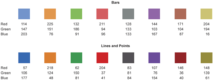
Maureen Stone of StoneSoup Consulting has done just that – and has done it quite brilliantly. Maureen is an expert in color for data visualization and she designed the following colors that work really well for displaying data in graphs.
The values for the red, green, blue scale are listed below each color in order that you may recreate the exact colors in everyday software tools such as Excel.
Check out more of Maureen’s work and her blog at: http://www.stonesc.com/wordpress/
How cool is this? Very.


