In today’s digital world, we can view websites and data visualizations wherever we go – on a laptop, tablet, or mobile phone. However, just because we can access digital material on various devices doesn’t mean that the content has been optimized or built for the device we are using at the time.
Mobile Frustration
Have you experienced the frustration of navigating a dashboard or data visualization that performs poorly on your phone? The mobile experience often falls short. Numbers might be cut off or hard to read; we might accidentally change something with a misguided finger swipe; the dashboard might not present a coherent picture in a long vertical phone layout. Yet, that same dashboard works perfectly when viewed on a laptop. The arrangement of the charts makes sense. We can use our mouse to click precisely on objects; the visual elements all come together to tell a story.
While not all dashboards require a mobile device layout, when a dashboard is available to anyone regardless of where, when, or how they are accessing it, creating mobile views becomes critical to accessibility. In this case study, we will use dashboards designed and developed by HealthDataViz for the New Jersey Safety & Health Outcomes Center for Integrated Data (NJ-SHO) to showcase the mobile versions created for their new website.
Accessing Traffic Safety Data from Anywhere
The NJ-SHO team required mobile-conscious designs so individuals on any device could access these publicly displayed dashboards. While most site visitors were expected to be traffic safety professionals and researchers, likely on computers, the NJ-SHO team understood that traffic safety is a crucial topic for everyone. Because the data’s relevance spans many scenarios, it was critical that users could identify an interesting data point on their office desktop computer and then effortlessly access and share that information from their phone during a city council meeting.
How did we create a mobile design for a dashboard primarily for desktop use? We had to consider the following four mobile design principles.
Design Preparation and Assumptions
When designing a standard desktop dashboard, the appearance of the website hosting the dashboard has a greater influence on the dashboard design than the monitor used to view it. The website likely dictates if the design layout will be landscape or portrait and the optimal dashboard height and width. With mobile design, however, we must consider the shape, size, and use of phones. Phone screens are much longer than they are wide, and while phones can adjust to a landscape orientation, most users prefer the standard portrait mode for one-handed scrolling and interacting. Tableau reflects this orientation in their mobile layout device builder.
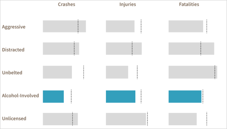
This layout does restrict our design options. For example, an initial design for the driver behavior dashboard used a small multiples chart to compare driver behaviors across different crash types (see figure below). However, with limited horizontal spacing on mobile—approximately 350 pixels—charts that worked well on a desktop view would appear too cluttered in the mobile view. For example, consider an initial design of a small multiples chart in the image below. This chart would not be ideal for a mobile device due to the narrow width available.
Redesigning each chart specifically for mobile would result in a very long and fragmented dashboard. The solution? Display one crash type and one driver behavior at a time and use a column design for each dashboard. With this new design prototype, we were able to develop a dashboard that easily could adapt to both display types.
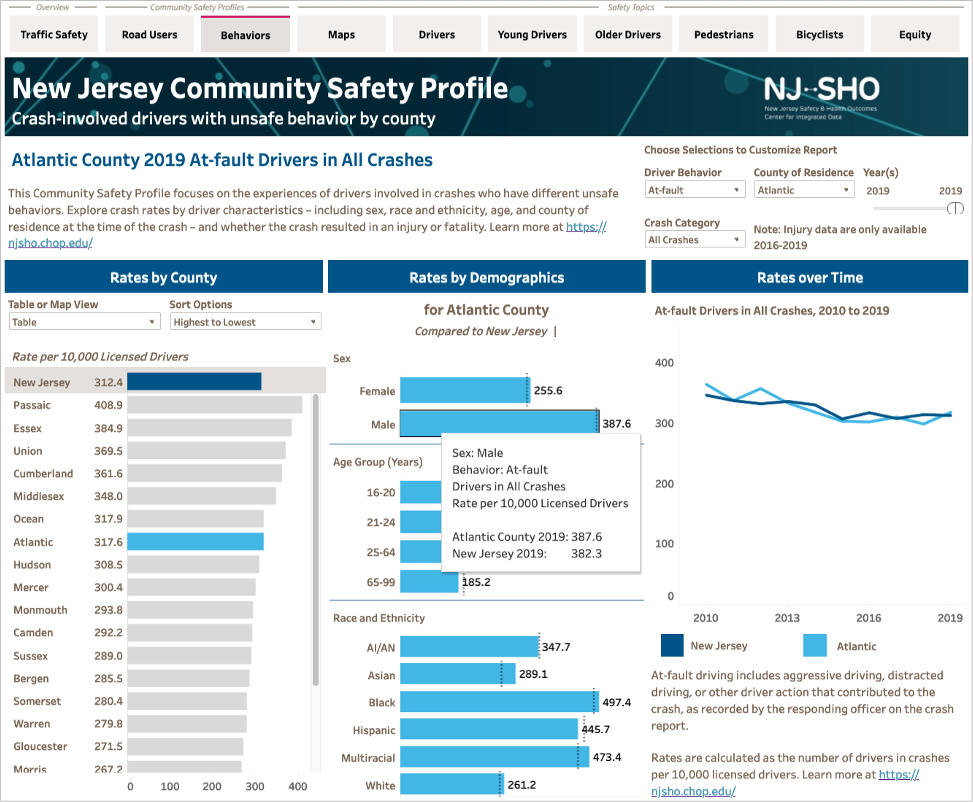

With the desktop version in landscape and the mobile version in portrait, columns could easily be arranged to fit both orientations – with columns side by side in desktop and stacked in mobile – resulting in the same user experience and data story. The designs are still desktop-first; however, using a mobile-friendly design format ensured the designs did not incorporate mobile-impossible elements.
Beware of Floating Objects
Should you use floating or tiled objects on a dashboard? It’s an age-old debate among Tableau users, with strong proponents on both sides.
Definitions: Objects added as tiles are allocated exclusive space on the dashboard and may not overlap one another. On the other hand, a floating object occupies a non-exclusive area of the dashboard, meaning that separate floating objects may overlap.
The challenge with a mobile view is that floating objects may not display in the intended position across different mobile devices. For example, a color legend floated on top of a map worksheet in the desktop view worked nicely, but the mobile view wasn’t as cooperative. Changing to a tiled arrangement resolved the issue by fixing the legend in place even as devices changed. Note that this change worked particularly well for New Jersey’s longer shape.
Choosing the Correct Display Setting
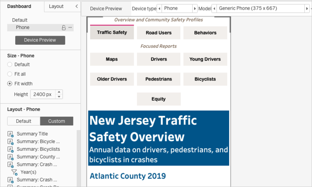
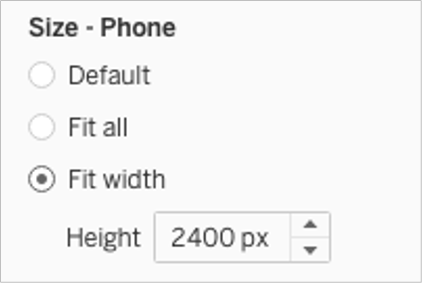
Unless you’re building a bite-size dashboard, you’ll be using the “Fit Width” display option for the dashboard and specifying a fixed height. Tableau’s “Generic Phone” default is 375 pixels wide. You can use the Device Preview to approximate the appearance of the dashboard on other phone sizes.
All elements on the dashboard without a fixed width will stretch to fill the available space. When you have multiple elements side by side, you must decide how you want those elements to share the space. You may want them to split the space evenly or have a component with a fixed width and another with a variable width.
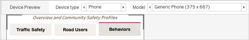
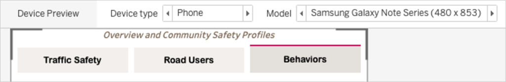
Below are examples of navigation buttons using “evenly distributed” spacing within their container, so each object adjusts evenly as the phone width increases.
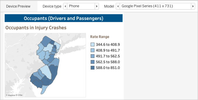
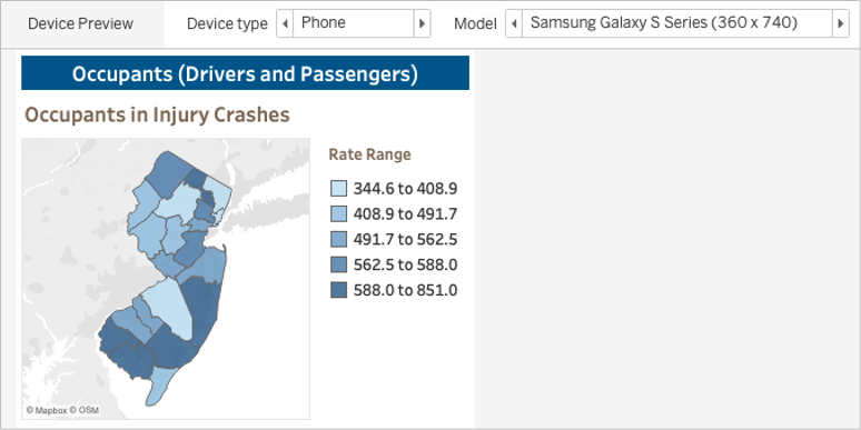
The color legends on the map dashboard are set to fixed width. The map expands or contracts to fill the remaining space, as shown in these images using previews of different-sized devices.
Different Devices = Different Results
Using Tableau’s Device Preview helps, but real-world variability still occurs after publishing dashboards. Users’ access method, website embedding and iframe codes, operating systems, and screen sizes all can significantly impact the final dashboard presentation. HealthDataViz and NH-SHO tested various mobile devices with different sizes to proactively identify phone display issues, such as text splitting onto multiple rows or getting cut off. Using the developer views in a desktop browser is a quick way we could simulate various phone sizes, replicate problems, share mobile views during meetings, and test solutions to any issues.
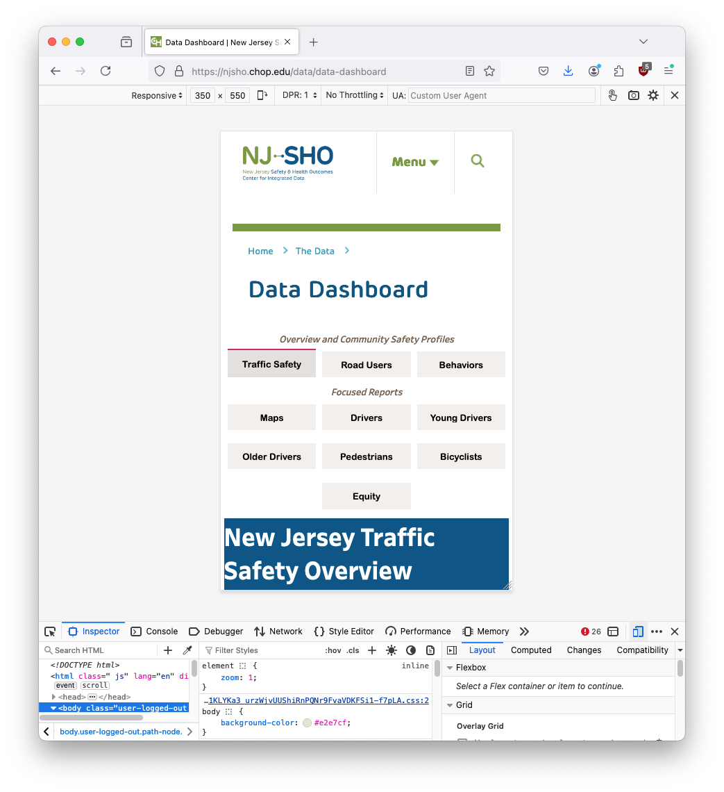
To access the developer view in Firefox, go to the menu, go to More Tools, select Web Developer Tools. Enable Responsive Design Mode from the More Tools menu or by selecting the phone icon in the web developer toolbar. This is not restricted to Firefox; your browser of choice likely has similar tools.
Ensuring that Tableau dashboards perform well across different devices can be challenging but is essential for successful implementation. Although each project encounters unique obstacles, the insights gained from our work with NJ-SHO will enhance future mobile development efforts.
Explore Desktop vs. Mobile
The final dashboards I developed can be viewed and explored on desktop and mobile. I encourage you to check out both displays to see how the selected device changes the organization of the dashboard objects while maintaining the placement and organization of available interactivity, chart types, and intended flow of the data story.
Want More?
For more examples of dashboards designed for both desktop and mobile displays, check out our work for Johns Hopkins’ Malaria Behavior Survey dashboard, designed and developed by Lindsay Betzendahl, our Director of Data Analytics and Visualization at Sellers Dorsey.