We often see dashboards designed with numerous mechanisms to enable users to slice and dice the data any way they please, hoping these options guide them to crucial takeaways and information. However, providing an a la carte “slice and dice” dashboard often requires revealing all available filters and parameters. Yet, too many options can be overwhelming and intimidating if a question or exploratory direction has yet to be discovered. Instead, we can utilize clever solutions to minimize visual clutter and help direct users to answer their questions without limiting the full capability of data exploration.

The Project
In a recent client project, we were tasked with designing a dashboard that required multiple parameters and filters. Our solution was to design it in a way that the user would only select a single filter at a time. This not only decreased the number of options shown on the page at once but also ensured a practical and user-friendly experience. Let’s delve into the specifics.
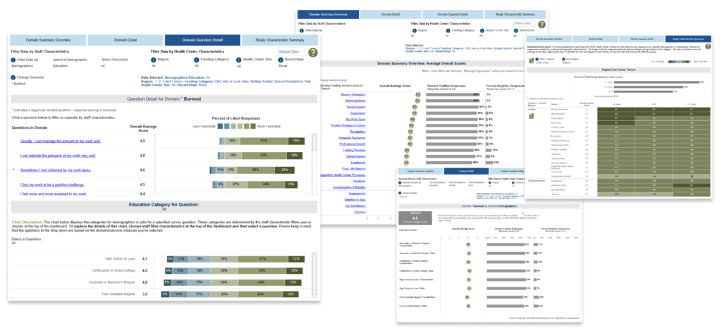
The dashboard we developed for the Health Resources and Services Administration (HRSA) Workforce Well-Being Survey is a testament to our commitment to efficiency. It allows users to identify insights quickly and easily by displaying results at different levels of granularity. This is achieved through the use of filters that can be applied to survey results based on respondent demographics and job categories.
The Challenge
This particular dashboard visualized survey results across various domains, with options to filter the data by specific characteristics such as job category level (for example, major job category or detailed job category) or by demographic type (for example, age, education, or marital status). However, due to suppression rules, the project required only one filter option to be applied simultaneously on the dashboard to ensure respondent anonymity.
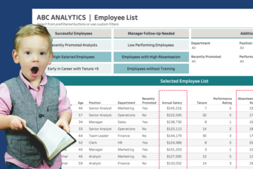
An initial design for the dashboard (image below) included a visible list of all the filter options at once. This certainly is a common approach we are used to seeing in dashboards. However, the failure point of this design is that it’s not apparent to users that they can only choose one filter at a time, which was a requirement in the design. Not to mention, listing this many filters all at once is a lot for most users and especially true for the public, who ultimately would have access to the dashboard.
The Solution
To better guide users to the correct filter, I utilized Tableau’s Dynamic Zone Visibility functionality (DZV for short) to dynamically reveal filter options based on a user’s previous selections.
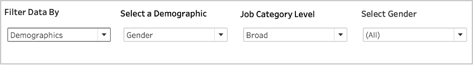
In the final design, I first show a parameter allowing the user to decide whether to view filters for demographics or job categories. This parameter is initially set to ‘None’ to keep things simple. Once the user selects an option, the DZV reveals the parameters of either Demographics or Job Category (listing associated options) and the filter itself.
For example, if ‘Demographics’ is selected, the parameter listing the available demographics, such as Race/Ethnicity, appears, followed by a filter to select one or more races/ethnicities. This design helps the user select one filter at a time and makes decision-making easier.
How-To Build It
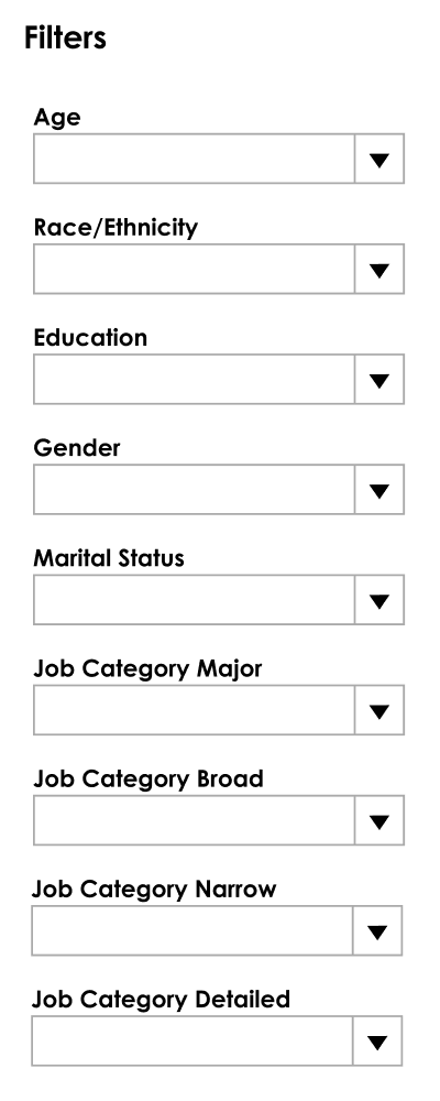
To build this solution, we will need the necessary parameters, a calculation to serve as our filter, and one DZV calculation for each parameter in the build. In this case, I required three parameters, one parameter-driven calculation to populate the filter values and three Boolean calculations for the DZV.
First, set up all necessary parameters. In this example, I used:
- A parameter to list the initial options: None, Demographics, Job Category
- A parameter to list out the Demographic options: Age, Gender, Race/Ethnicity
- A parameter to list out the Job Category options: Major, Minor, Narrow, Detailed
Hot Tip: Using integer values in your parameter, and subsequently in connected calculations, is more performant than using string values.
Example of #1 above:
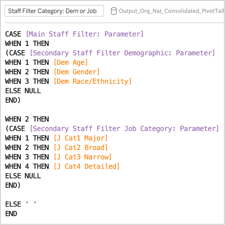
Next, create a calculation that dynamically changes available values based on the selections in the previous parameters. This will be used for our final filter selection.
Example logic calculation used to create the dynamic filter:
Once all four objects are created, place them side-by-side in a horizontal or vertical container, depending on your dashboard layout.
Next, create three Boolean (true/false) calculated fields to use for the dynamic zone visibility based on what is selected in the initial parameter.
Hot Tip: DZV can only be used with a field or parameter that is either Boolean, a single value, or independent of the viz (e.g., a constant value independent of the structure of the viz, such as a fixed level of detail (LOD) calculation).
Example Boolean calculations to use with DZV:


Finally, we need to apply the Dynamic Zone Visibility calculations to the three elements that we’d like to show or hide based on the user selection.
- Click on the Demographic Parameter
- Go to the Layout tab and check the box next to ‘Control visibility using value’
- Select the calculation ‘DZV: Demographic Parameter’ (Note that this is actually a calculated field that simply has ‘parameter’ in the name as it references the Demographic Parameter)

Repeat these steps for the Job Category parameter and the dynamic filter object.
There you have it! This technique can be used for many aspects of your dashboard to ensure the display of the right amount of information and to support a successful dashboard interpretation and experience.
Want More?
Be sure to subscribe to our blog so you don’t miss an upcoming blog post featuring how to create a global reset filter and how to display an error message alerting users of conflicting filter selections.
What if your organization doesn’t have the most recent version of Tableau to use that has DZV (v.2022.3)? You can learn about a non-DZV approach in HealthDataViz’s Senior Consultant Lindsay Betzendahl’s personal blog where she shows you using Tableau’s Superstore data set and links to a workbook you can download to dig into the details.