Here’s an example of a real-world problem. In a deprived inner city borough of the U.K. with the usual range of problems — drugs, gangs, gun and knife crime, alcohol-fueled disorder — we have a multi-agency collaboration to attempt to make the streets safer by forestalling trouble before it arises. Partners include the Accident and Emergency (A&E) Dept. of the local acute hospital (‘Emergency Room’ in US parlance), community safety teams, public health, alcohol and substance abuse teams, and the police.
Simplifying somewhat, the process is that the A&E Dept collects completely anonymous data on any attendance associated with assault or suspected assault, including date and time of incidence, type of assault and weapon, age in whole years, sex of patient, and location of the incident. These data are shared with law enforcement agencies to improve planning and scheduling of future deployment of officers and patrols. The anonymity aspect is important because (a) personal health data is not collected for this purpose, so under UK law it would be unlawful to share it among the partners, and (b) we need data on every incident and injured person, regardless of whether they were perpetrator, innocent victim, or somewhere in between, and we need those whose involvement may not be entirely blameless to trust us enough to make their data available. The output from the hospital system is a flat .csv file. One question which arose is, how to characterise who is likely to be involved in an assault and when? As ethnicity data is not at present available, this has to be in terms of age and sex. The only presentation tool available is Microsoft Excel. First thoughts were small multiples, one for each hour in the day, but whether as line or column charts these were hard to interpret and generally unsatisfactory. What about putting time as a horizontal axis, age as a vertical axis, and the marker carrying an indication of numbers in the category? After a bit of experimenting we came up with the idea of a Soda Chart.
Soda charts
Soda charts are a variety of bubble chart, for data that can be structured into two-dimensional tables. We named them for the visual resemblance of the columns of bubbles to the bubbles in a glass of soda (being a public sector organisation we cannot run to champagne…). This is what we eventually came up with.

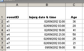
In the example we are looking at, the ages of people injured in assaults attending an A&E department are broken down by the hour (of 24 hours) when the injury took place. Our file contains quite a few fields, but for this purpose all we need are a record ID, the date and time of injury, and the age of the patient, like this:
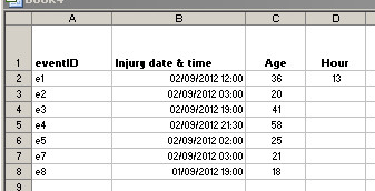
To obtain the Hour from the Injury date & time fields, we can use the HOUR function. Excel’s default hours run 0 to 23; we want ours to run 1 to 24 so we need to add 1 to the calculation. The reason being midnight to 1am would be represented by “1” and 11pm to midnight would be represented by “24”.
- In cell D1, type in the heading “Hour“.
- In cell D2, type in the formula: =1+HOUR (B2).
- If necessary, format cell D2 to Number and 0 decimal places.
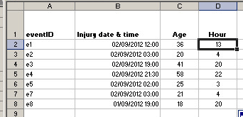
To calculate the remaining cells in column D:
- Click your cursor on cell D2 to highlight.
- Click on the tiny square in the lower right corner of the cell’s border and drag down the column. This will copy the formula down the column.
From this data, generate a pivot table with Hour as the column heading and Age as the row heading, and count of eventID as the data field.
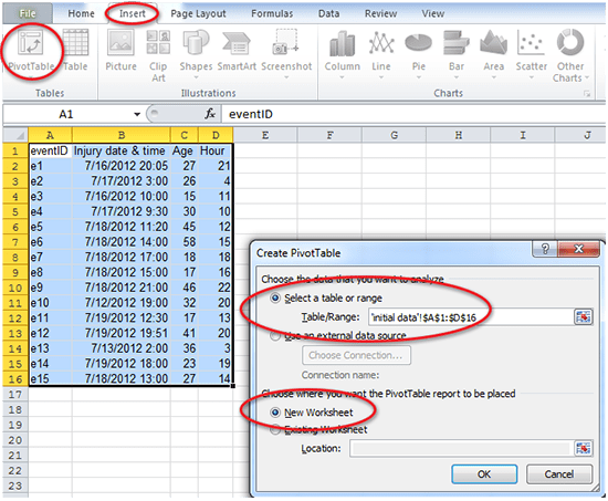
- Highlight the table/range of data: A1 to D16.
- Click Insert.
- Click on the Pivot Table icon.
- Ensure the same information shown in this screenshot is displayed on your Create PivotTable pop-up box.
- Click OK.
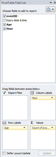
- Click the Age checkbox. Move to the Row Labels box.
- Click the Hour checkbox. Move to the Column Labels box.
- Click the eventID checkbox. Move to the Values box.
Copy the resulting pivot table (click on the top left rectangle and press CTRL-V) then PASTE SPECIAL VALUES (ALT-ESV) to keep only the values. If your pivot table included Grand Total rows and columns, delete them.
This is how this small sample of data looks now in a pivot table. For ease of viewing, we colored the different sections: Age – orange; Hours – blue; Values – yellow.
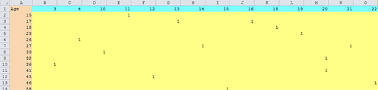
- Row represents Age
- Column represents an hour in the 24-hour time clock
- Value in the yellow section represents a person in the datafile
Switch to the Complete Datasource tab in the Excel file to view the complete dataset.
Bubble charts, like X-Y scatter plots, need three components:
- Numeric X axis coordinates
- Numeric Y axis coordinates
- Numeric data to size the bubbles.
For this soda chart, each set of rising bubbles is a separate data series:
- Numeric X axis: Hour of the day
- Numeric Y axis: Age of the victim
- Bubble size: the Value of the number of assaults.
To produce the soda chart the data needs to be arranged like this (see ‘soda chart data format’ tab in the Excel spreadsheet for the complete set of data):
| Hour | Age | Value | Hour | Age | Value |
| 1 | 1 | 2 | 1 | ||
| 1 | 2 | 2 | 2 | ||
| 1 | 6 | 2 | 6 | ||
| 1 | 7 | 2 | 7 | ||
| 1 | 8 | 2 | 8 | ||
| 1 | 9 | 2 | 9 | ||
| 1 | 10 | 2 | 10 | ||
| 1 | 11 | 2 | 11 | ||
| 1 | 12 | 1 | 2 | 12 | |
| 1 | 13 | 2 | 13 | ||
| 1 | 14 | 1 | 2 | 14 | |
| 1 | 15 | 2 | 15 | 1 | |
| 1 | 16 | 3 | 2 | 16 | 1 |
| 1 | 17 | 7 | 2 | 17 | |
| 1 | 18 | 6 | 2 | 18 | 1 |
| 1 | 19 | 1 | 2 | 19 | 3 |
| 1 | 20 | 3 | 2 | 20 | 1 |
| 1 | 21 | 3 | 2 | 21 | 5 |
This shows the start of the first two series. It is possible to produce the chart with only a single age column, but in this format it’s a lot easier to follow what’s going on (and to automate if your VBA programming skills are up to it, but see the attached workbook).
- Make a copy of the table (in case you go wrong and need to start again).
- Insert two columns before each column in the table.
- Head the first column Hour, copy the hour value for the column (the first column is hour “1”), and copy this value all the way down (the quickest way is again to click and drag the lower right corner of the cell border).
- Copy and paste the Age column into the second inserted column.
You now have columns of triplets — the Hour column is your X-axis, the Age column is your Y-axis, and a Value that will be used to size the bubbles. Each of these triplets will form a series in the bubble chart.
At this point there may be differences between versions of Excel. These instructions are for 2010.
- Highlight the first series triplet data (data only, do not include the column headers).
- Click the Insert tab.
- Locate the Charts group and click on Other Charts.
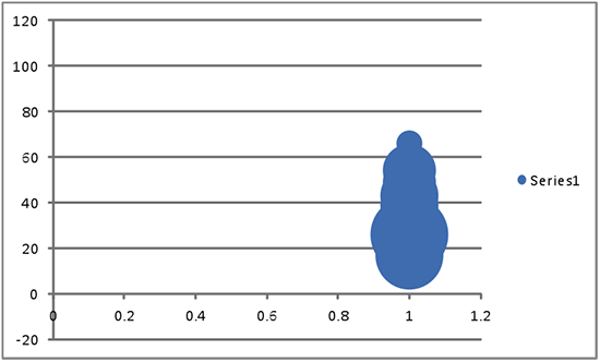
- Under Bubble, select the plain bubble chart (please don’t use the 3-D version!). Excel will create something like this:
- In the Chart Tools, Design tab, click on Select Data.
- Click the Add button. You are now going to add all the data for Hour 2.
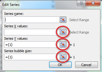
- Leave the Series name blank.
- For the Series X values (X-axis), click the Range icon. Highlight the Hour 2 column (data only, no header). Click the icon again to close.
- For the Series Y values (Y-axis), click the Range icon. Highlight the Age column for the Hour 2 triplet. Click the icon again to close.
- For the Series bubble size, click the Range icon. Highlight the Value column. Click the icon again to close.
- Click OK.
- Click Add again, and do the same for the remaining triplets.
The chart now looks like this. Now to do some formatting…
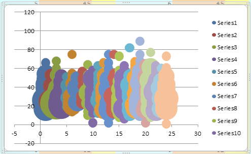
- Click on the legend at the right to highlight. Delete the legend.
Excel will have defaulted to assigning a different colour for each of the series, and bubble sizes too large for the chart.
- Right-click each series in turn and select Format Data Series.
- In Series Option, Scale Bubble Size to 15.
- In the Fill section, select Solid Fill and select a light blue color fill.
- In the Border Color section, select Solid Line and select a darker blue color border.
- In the Border Styles section, change the Width to 1pt.
To format the Axes:
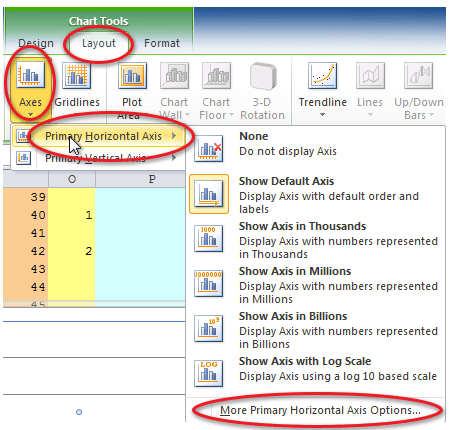
- Under Chart Tools, select Layout, then select the Axes icon.
- Select Primary Horizontal Axis.
- Select More Primary Horizontal Axis Options…
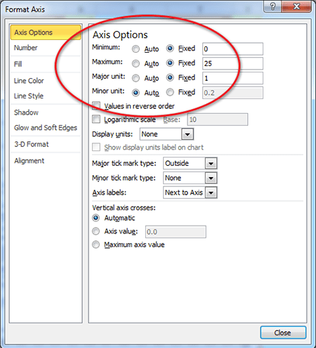
- Set the Minimum to Fixed and 0.
- Set the Maximum to Fixed and 25.
- Set the Major unit to Fixed and 1.
- Click Close.
For the Y-axis:
- Under Chart Tools, Layout, select the Axes icon.
- Select Primary Vertical Axis.
- Select More Primary Vertical Axis Options…
- Set the Minimum to Fixed and 0.
- Set the Maximum to Fixed and 100 (we used 0 to 100 for Age).
- Set the Major unit to Fixed and 10.
- Click Close.
To add Axes titles:
- Under Chart Tools, Layout, in the Labels section, select Axes Titles.
- Select Primary Horizontal Title.
- Select option Title Below Axis.
- Change title to “Hour of Day (1=midnight to 1am; 24=11pm to midnight)“.
- Select Primary Vertical Title.
- Select option Horizontal Title.
- Change title to “Age of Victim“.
To add Chart title:
- Under Chart Tools, Layout, in the Labels section, select Chart Title.
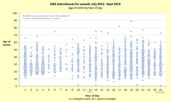
- Change title to:
“A&E attendances for assault, July 2012 — Sept 2013
Age of victim by hour of day“
We think it can be good practice to add interpretive text, so we added a text box in the plot area describing what the bubbles mean, and text boxes below the X-axis showing midnight, noon and midnight again.
We’ve also placed an Autoshape box with no border and fill set to the chart area fill colour over the right-most X-axis label (25) and the left-most X-axis label (0) since we don’t need those to appear in the final result.
And there you have it.
If you’ve made it through this far, you will probably have found the process rather long, tedious, and repetitious. We certainly do, so we decided to automate it, using VBA, in the accompanying workbook, which you are free to use and adapt (at your own risk!). We have tested this in Excel 2003, 2007 and 2010, and it seems to work in each.
All you need to do is to copy the crosstab values from your pivot table into the Source worksheet, click the button on the Update sheet, and tidy up the titles and formatting in the chart. You might need to enable macros/active content.
A lot of the VBA relates to formatting, but a particular point to note is that it will work with fewer triplets of columns (e.g. 7 for days of the week etc.), as long as there are complete triplets.
Click here to open a window containing the full VBA.
Text © Meic Goodyear 2014
VBA © Brian Coutinho 2014


0 Comments