Have you ever had one of those palm-smacking-forehead moments when you knew that even if it were raining brains, you wouldn’t get wet? Me, too — had one just the other day, as a matter of fact.
Here’s what happened. I was delivering a talk about data visualization to staff at a large health plan. When I got to the part about the Gestalt Principles of Design — specifically the concept of connectedness — a woman in the audience raised her hand and asked, “you mean like the way the ancient Greeks connected stars to create constellations?” Why, yes: exactly like that (cue sound of palm smacking forehead)!
It is a truly rewarding experience when I have direct evidence that a) members of an audience are actually listening to me; b) they link a concept I discuss directly to something in their work or personal life; and — the mother lode — c) I have an “ah-HAH!” moment right along with them. How many times have I gazed up at the night sky with friends and family and connected the stars in my mind to see the Big and Little Dipper, or used the way-cool “Stars” app from Space.com on my smartphone to identify Gemini or Taurus (my daughter’s and my astrological signs) — never once making the connection to the Gestalt Principle of Uniform Connectedness? Clearly my client’s comment was a sign that I should write a newsletter on the topic.
The principle of uniform connectedness states that elements tend to be grouped together if they are connected by other elements. Consider the following examples:
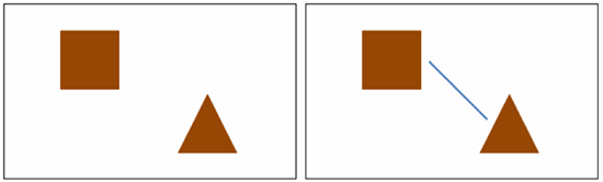
On the left we see a box and a triangle — two different shapes placed on the page, independent of each other. The right view shows the simple addition of a line that changes our perception entirely. Be sure to note that the line isn’t touching or even attached to the two separate shapes in any way; but we still perceive a connection.
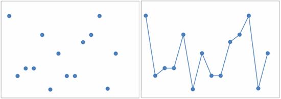
In the left of these two images are a number of uniform points arranged in no perceptible (as yet) grouping or pattern. On the right, the simple addition of another element — a line — changes our perception completely, and we now recognize the points’ connection, and watch a pattern emerge.
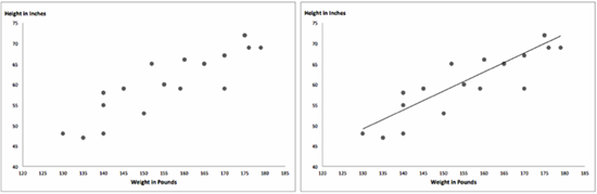
This last example is a pretty familiar one: the scatterplot. On the left is a series of points encoding an individual’s height and weight, offering perhaps a glimmer of an interesting story in the data. On the right, a graph with the simple addition of a line helps us easily perceive that story: the positive correlation between height and weight. This is the Gestalt Principle of Uniform Connectedness!
So why does studying and understanding Gestalt Principles matter to the work we do in communicating healthcare data and information? Well, the visual world is so complex that the mind has developed strategies for coping with the confusion. To enhance those coping strategies, and ease that confusion, we study principles like these so we can put the designers (you and me) in control of what the viewers see. It is our job to understand how people visually perceive data and information, so that we can figure out sure-fire ways to grab and hold their attention, communicating the message in the data clearly and persuasively. If we firmly grasp the principles of design and data visualization, and master the visual display of data, we can make clear the opportunities to improve our healthcare system, and move people to take action.

When you next look up into the night sky and see stars, I hope you will also be able to make the connections the way the ancient Greeks did. And as you stand stargazing before this most magnificent patterned data display of all, if you just happen to see the constellation Hercules, say “hello” from me.


0 Comments