I am grateful to newsletter reader Meic Goodyear, who was kind enough to share a very interesting project that he and his colleague Brian Coutinho have been working on. Here are Meic’s description of the project and the associated data visualization-a soda (bubble) chart that he and Brian created using Excel.
In a deprived British inner-city borough with a range of problems (drugs, gangs, gun and knife crime often fueled by alcohol abuse) is a multi-agency collaboration to make streets safer by anticipating and forestalling trouble of various kinds. Partners in this effort include the Accident and Emergency Department (A&E Department, or Emergency Department in the U.S.) of the local acute hospital; community safety, public health, alcohol and substance-abuse teams; and the police. The process (simplified) is that the A&E Department collects anonymous data on any assault or suspected assault it attends, recording
- date and time of assault
- type of assault
- type of weapon
- victim’s age
- victim’s gender
- location of incident
After toying with a few possibilities, Meic and Brian decided to display the de-identified information in a bubble chart to show some general parameters (victim age by time of day of assault). The hope was that, armed with this information, law enforcement could significantly improve planning and scheduling officers and patrols, thereby reducing assaults.
Here is the chart Goodyear and Coutinho created:
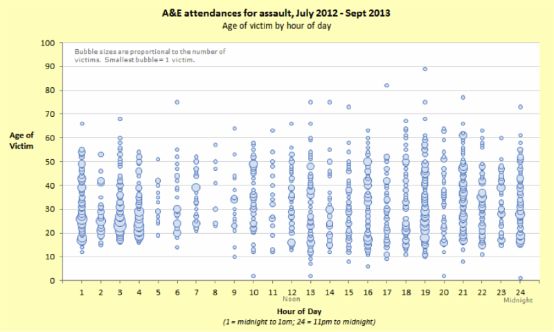
The age of the victim is on the X-axis, the time of assault on the Y-axis. The size of the bubble represents the number of assaults. Use of the bubble display reveals some interesting data:
- a large number of assaults happen early in the morning (1-4 AM)
- victims during this time period are relatively young, mostly between 20 and 30 (perhaps because this is when night- clubs start to empty)
- assaults begin to diminish after 4:00 AM, then trend up again around 7:00-9:00 PM
Displaying the data in this way allows the viewers to see that more patrols may be of benefit at the highlighted times, and-given the large number of assaults on younger people in the early morning hours-that a public-education campaign about how to get home safely after a night out might be effective in reducing assaults.
As with any problem of this seriousness and magnitude, additional analysis can help inform and refine plans to address underlying causes. To that end, we could also display data on the same type of graph; but instead of plotting age on the X-axis, we could put assault type or victim gender there. Sorting with these filters might reveal additional information useful in composing, fine-tuning, and targeting public safety messages.
Here’s the deal. A bubble chart is really just a modified scatter plot: it uses the vertical and horizontal positions of objects to encode two sets of values. The bubble plot in particular, however, adds a third dimension (in this case, the number of people being assaulted), an enhancement that helps us to visualize and consider additional information.
By the way, in the hands of the right people, bubble charts can be both enlightening AND entertaining. If you want to see a really impressive example of this dual function, check out this very popular video of Hans Rosling showing health-population statistics-fun and cool!


0 Comments