Of special interest to me was a description of perceptual learning modules designed to improve the way medical students are trained. The University of California at Los Angeles (UCLA) medical school has included several of these modules in its standard curriculum to help students become faster and more skilled at reading electrocardiograms, identifying rashes, and interpreting tissue biopsies. The training modules display lots and lots of visual data about these and other conditions in a manner that leverages human’s innate perceptual skills, such as pattern recognition. As a result, medical students rapidly and significantly improve their ability to really understand what they’re looking at, and to quickly and accurately identify abnormalities. The students are learning to see data.
Of course developing and using this type of training module means that we must understand how humans see and grasp data and information. Those who design and create a wide range of communication media must study how our vision and cognition work in order to come up with many different types that respond to, guide, and enhance full perception and comprehension for everyone in significantly differentiated audiences-quickly, accurately, and with as little fatigue, strain, or misunderstanding as possible.
Let’s review a few (and I do mean just a few) of the things we know about how people see and understand data, and how we can build on this knowledge to design better healthcare reports and dashboards.
Gestalt (Pattern) Principles
Gestalt is a term used in psychology that means “unified whole.” It refers to theories of visual-perception development that describe how people tend to organize visual elements into groups or unified wholes when certain principles are applied. Understanding these principles makes it much easier to optimize the arrangement of data in your reports and dashboards.
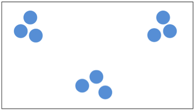
- Proximity. Objects arranged close together are perceived as a group. The blue circles are all the same in the illustration below, but when sub-groups of them are placed in different areas of a page, we perceive them as being different.
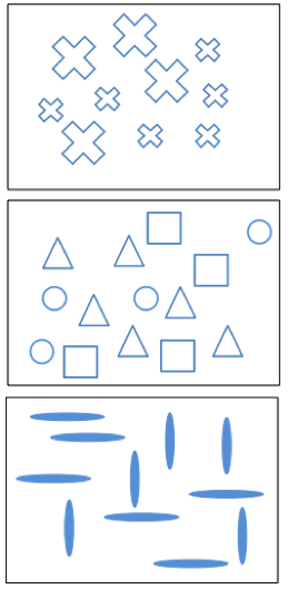
- Similarity. Objects that share similar attributes are perceived as being part of a group. Although the shapes in the graphics below are different in size or in their directional orientation, what they have in common (blue outlines, for example, or having the same general shape) leads us to see them as a group. Even when different shapes are randomly placed on a page, we cluster similar ones, and think of them as a group.
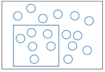
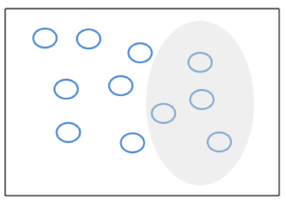
- Enclosure. Objects collected within a boundary-like structure are perceived as a group. All of the shapes below are the same, but by placing a line or shading around some of them, we signal to an observer that the corralled objects form a group.
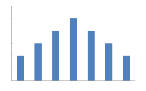
- Closure. Open structures are perceived as closed, complete, and regular whenever there is a way that they can be reasonably interpreted that way. Using lines along the X and Y axes causes people to see the set of bars here as closed.
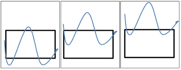
- Continuity. Objects aligned (apparently or in reality) or in continuation of one another are perceived as a group. Although each of the lines shown is separate and distinct, the alignment of the trio makes it appear that one is a continuation of another across all three boxes.
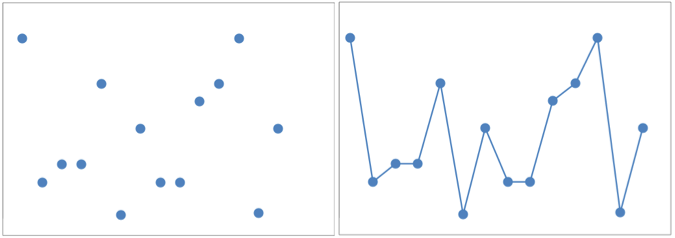
- Connection. Connected objects are perceived as a group. The simple addition of a line changes our perception of random points on a page: we see a trend or some relationship between and among the points.
These are but a few of the things we know about the ways people perceive data and information. Take a look at some of my earlier posts for more details, and a list of recommended books on the topic. And welcome to the club of those who like me find the work described in the Times article encouraging. Not only will enhanced perceptual learning make the communication we enable and the healthcare we support better, but as more people become aware of these crucial skills, I will have an easier time explaining what it is, exactly, that I do!
0 Comments