Like a lot of people I am a big goal-setter. I especially love BHAG’s [pronounced “Be- hags”?]: Big, Hairy, Audacious Goals.
You know: the ones based on no logic or well-developed plan whatsoever, but rather conjured up by the sheer and (sometimes) delusional belief that “Somehow, I will find a way.”
Exhibit A: starting a business with a kid headed off to college and a big-ass mortgage (a technical term in my household). To be fair, I also set a lot of smaller and saner goals for myself: the amount of money I wanted to save for retirement each year; the number of trips to the gym each week.
As 2015 ends, I find myself going back over the year to consider what I accomplished compared to the goals I set, and visualize what I hope to accomplish in 2016. As is often the case, my mind wanders to different data visualization techniques and how I might display actual vs. desired progress using graphs.
Yes, I hear you: “Memo to self: add ‘Get out more!’ to my 2016 goal list.”
A graph I often use to show how well a group performs compared to a goal or benchmark is a deviation graph.
(If you are a regular subscriber to this newsletter, you’ll recall that I have written more than one article about these types of graphs; you can check out those articles by clicking here.)
I especially like them on monitoring dashboards, because the absolute value of a changing goal or benchmark is not displayed – only the difference or deviation of actual performance from it is shown, as in the following example.
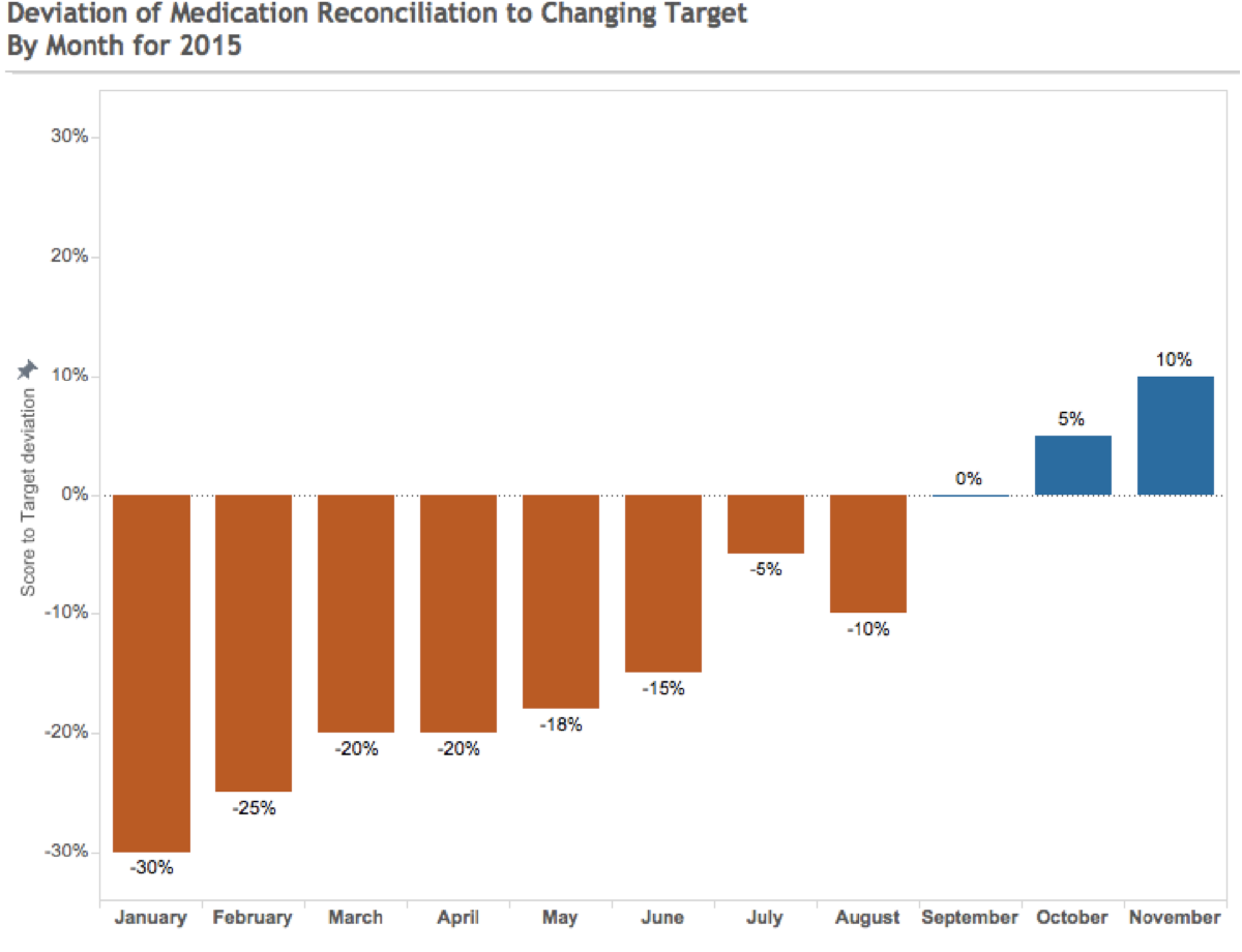
Displaying the information like this allows the viewer to quickly and easily answer questions such as “Are we over or under budget on revenue or expenses?” or to evaluate medication reconciliation versus a target without worrying about the actual goal or performance values, as they often change over time or are different for a group or category of similar metrics (department budgets, for one).
Such a display lets them know if performance is above or below goal, and by how much.
Sometimes, a goal is set for a longer time frame, and we wish to display its actual value compared to performance. Most often a line graph like the one shown here is used for this type of display.
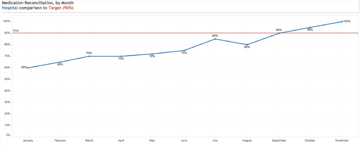
While this is a perfectly acceptable way to show the data, it doesn’t clarify how far from target we are.
This is where a deviation graph – one that displays the actual target value and the actual performance difference or deviation, such as in the one below – can help.

This data display makes clear that the target is 90% on medication reconciliation, and how far below (orange bars) or above (blue bars) monthly results are. It’s also possible to see actual performance by comparing the ends of the bars to the Y-axis.
All three of these displays work – as long as they respond to these key criteria:
- are target values fixed or variable?
- is it enough to simply monitor deviation, or must actual values be displayed?
As I write this, and consider my options for displaying my own performance compared to my 2015 goals, I am beginning to get a little spooked. I may after all be awash in orange (below target!!) for some time.
But then I remember a famous comment by American author, salesman, and motivational speaker Zig Ziglar: “If you aim at nothing, you will hit your target every time.” Back to that BHAG list – and onward.


0 Comments