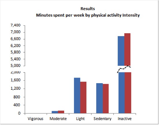
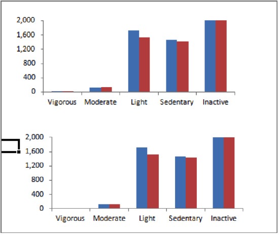
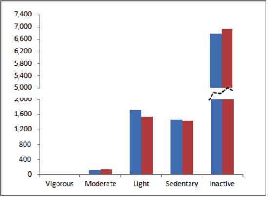
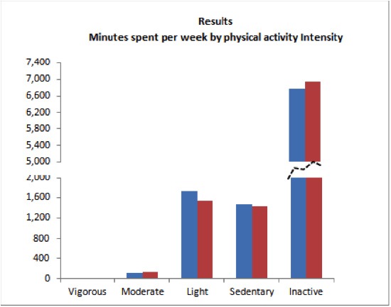
This type of chart is often used when a few data points greatly exceed the others. When plotted on a standard chart the other values are dwarfed. The chart actually consists of two charts. Both charts use the same data but have different value axis scaling. Creating this type of chart is a manual process and may require a fair amount of tweaking to position the charts.
Making the Chart
Step 1 – Create your chart.
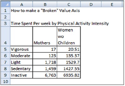
- Select cells A4 through C9.
- Select the “Insert” tab.
- In the “Charts Section” click the down arrow under “Column”, then select the first selection under 2-D bar for “Clustered Column” chart type.
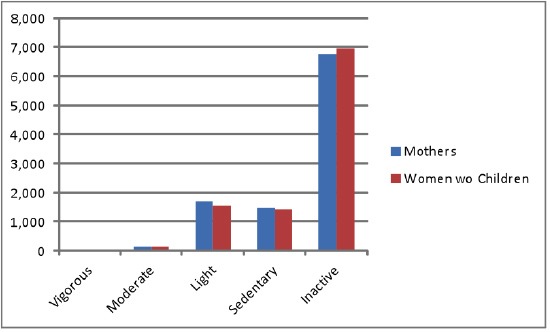
Step 2: Delete the legend. Click the legend and press delete.
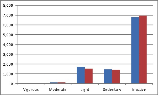
Step 3: Format Y Axis.
- Right click on the Y axis (vertical).
- Select “Format Axis”.
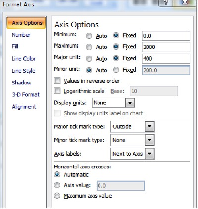
- Under “Axis Options”:
- For “Minimum” select “Fixed” and type 0 in the box.
- For “Maximum” select “Fixed” and type 2000 in the box.
- For “Major Unit” select “Fixed” and type 400 in the box.
- Click “Close”.
Step 4. Delete Grid Lines: Click on horizontal grid lines and press delete.
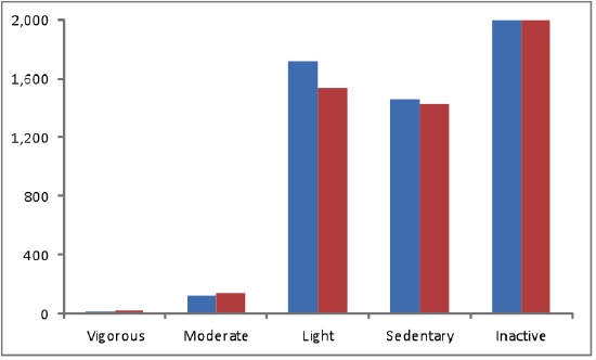
Step 5. Size Chart. Click the chart and drag the handles to the desired size.
Step 6. Make a copy of the chart. Press CTRL and D together to make a copy of the chart.
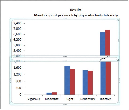
Step 7. Position the new chart over original. Click on the new chart and drag to location above original chart.
Step 8. Format the red bars of new chart.
- Click on red bars then click the first red bar associated with “Vigorous”.
- Right click and select “Format Data Point”.
- Under “Fill” click on “No Fill”.
- Under “Border Color” click on “No Line”.
- Click on the next red bar.
- Repeat the above for all red bars EXCEPT the last red bar for “Inactive”.
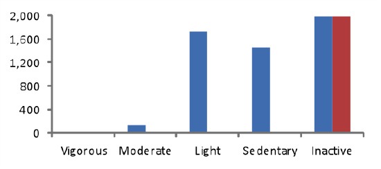
Step 9. Format the Blue bars of the new chart.
- Click on blue bars then click the first blue bar associated with “Vigorous”.
- Right click and select “Format Data Point”.
- Under “Fill” click on “No Fill”.
- Under “Border Color” click on “No Line”.
- Click on the next blue bar.
- Repeat the above for all blue bars EXCEPT the last blue bar for “Inactive”.
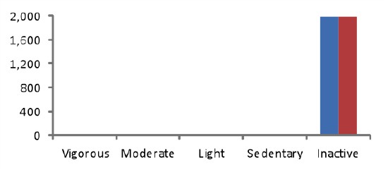
Step 10: Format Y Axis of new chart.
- Right click on the Y axis (vertical).
- Select “Format Axis”.
- Under “Axis Options”:
- For “Minimum” select “Fixed” and type 5000 in the box.
- For “Maximum” select “Fixed” and type 7400 in the box.
- For “Major Unit” select “Fixed” and type 400 in the box.
- Click “Close”.
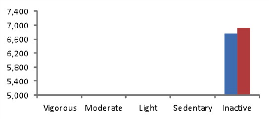
Step 11. Format X Axis of new chart.
- Right click on the X axis.
- Select “Format Axis”.
- Under “Axis Labels” click the down arrow and select “None”.
- Under “Line Color” select “No line”.
- Click “Close”.
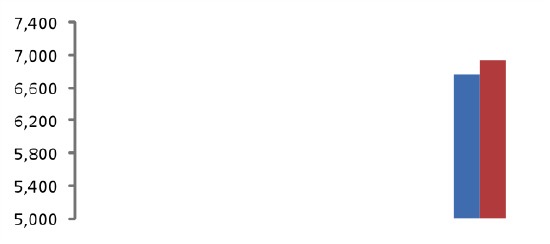
Step 12. Position New Chart over Original Chart. Click on new chart and drag to a position over the original chart lining up the X axis.
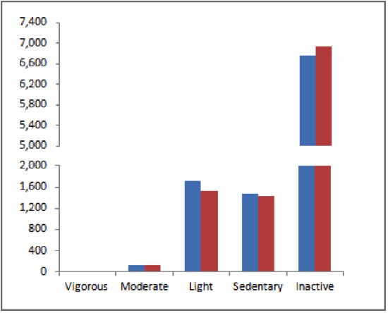
Step 13. Add the Free Form Shape. This shape indicates the column is not continuous between the two sections of the column for “Inactive”.
- Click on the Insert tab.
- Click on the Shapes icon then select Scribble.
- Draw the shape between the two graph lines.
- Then right click on the shape.
- Select ‘Format Shape’.
- For Line Color, select a dark grey.
- For Line Style,
- For Dash Type, click the down arrow and select a type.
- For Width, enter 1.5.
Step 14. Type title of chart in a cell above the 2 charts and center.


0 Comments