This uncertainty made us worry (a lot) about our raw scores; but we obsessed just as much — or more — about how well (or poorly) we did compared to everyone else. Where did we rank alongside the competition? How would the ranking affect our chance at those coveted college spots? We were fixated on percentile results.
Here’s why. A percentile (as opposed to a score) tells you how you did compared with everyone else.
For example, if you were in the 90th percentile on the math sections of the SAT, you’d scored higher than 90% of the students who took the test with you. 47th percentile meant better than 47% of those students, and so on. Percentile results often made the difference between our first and second — or dead, desperate last — college choices.
Note further that a percentile score is not like a grade out of 100. If you’re in the 90th percentile, this doesn’t mean you got 90% of the questions right. It just means that compared with everyone else who took the test on that day, you scored higher than 90% of them.
Fast forward to survey results and comparisons that we encounter today, such as the Consumer Assessment of Healthcare Providers and Systems (CAHPS). These results may be displayed with the additional context of comparison percentile results; the big challenge is how to get all of this information into a visual display easily understood by the viewer.
Here’s an approach worth considering.
Survey Results
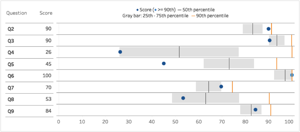
The second of the two graphics below displays how a specific group scored on several different survey questions (e.g., “Did you receive instructions about your medications?”). The display includes comparisons to all survey results.
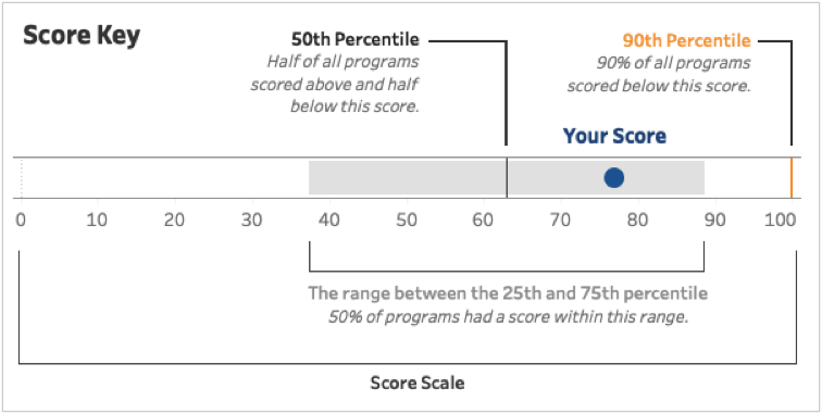
The following diagram explains each part of the graph below it.


Score Scale
Now we can see (for example) that on Question 2, the group scored 90 (blue point), which was higher than the results from the 25th to the 75th percentile (gray bar), and than the 50th percentile (black line); and just slightly lower than the 90th percentile (orange line) results for all other groups combined.
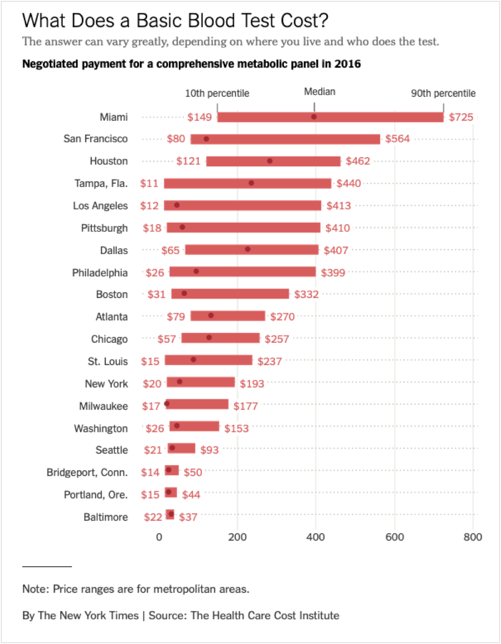
The Price of Blood Tests
Interestingly, not long after I started writing this post, the following display of the price range for of one of the most common blood tests in medicine (metabolic blood panel) in different U.S. cities was published in the New York Times.

In this display, the overall approach is fundamentally the same as in the first example I displayed above. A bar is used to show the range of prices from the 10th to the 90th percentile, or the low and high prices in each city, and a point to show the median price. The display also includes the price details on each bar, making it easy to see and compare the prices between cities.
Final Suggestion
If you feel a bit confused by the percentages and percentiles in the second graphic, versus your understanding of the somewhat clearer display of dollars and percentiles in the third, you’re not alone — but the former is the data we work with regularly, so we need to find ways to communicate it effectively.
If you think this type of display will work for some of the data you have (and I encourage you to give it a try), then I suggest that you create and include a diagram like the one in the first graphic — the “Score Key” — which explains the different parts of the display to viewers who may be new to your data, or who may have little experience with statistics.
In full disclosure, I found myself struggling to explain the first display quickly and easily before I sat down and studied it a bit. But once I saw the Score Key (thank you, Lindsay, on team HDV), it became crystal clear to me.
Hey, we’re all in this together and we all need a little help once in a while — well, that, a cocktail, and a nap.


0 Comments