Well, it would be if it weren’t for the fact that I’ve been contemplating displays of data on the leading causes of death. Nothing like a table of death statistics to ruin a perfectly serene morning.
Here’s how it all started.
Cambria Brown, one of our HealthDataViz team members, sent me a link to the Pan American Health Organization’s website with a note that she was itching to do over its displays. I took a look and agreed: there is most assuredly room for improvement. The web page displays its data in three different formats, to all of which we have offered changes and corrections.
Table
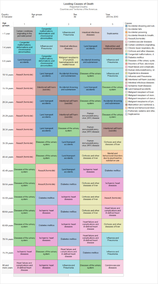
Current (Below):
The first display is a color-coded table, where the columns show the top five causes of death, encoded with different colors, and the rows represent age strata. The table allows the user to choose the country, age, time-frame and gender displayed.
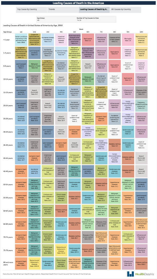
Proposed (Below):
We kept the original layout of the rows and columns, which allows the viewer to see and compare the leading causes of death by age; but made the following changes.
We
- selected a broader range of colors, so that the different causes of death are easier to spot.
- added an interactive slider that lets the user select up to ten causes of death versus only five in the original table.
- displayed the rates per 1,000 people in each square of the table, providing useful additional context.
- eliminated the Key, since everything in it is already in the table, making the former redundant.
Treemap
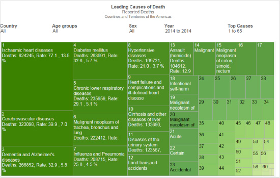
Current (Below):
The second display on the site is just plain wrong. As I explained in my February 2019 newsletter,
- Treemaps present data hierarchies not easily displayed via a bar graph.
- The data here is neither hierarchical nor complex, and is clearer displayed as a bar graph.
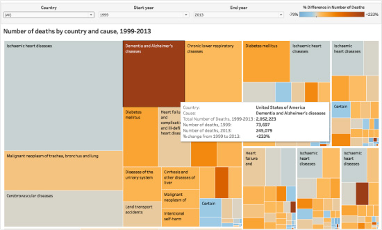
Proposed (Below):
If the goal is to display only one data dimension, stick to a bar graph. If however you want to show several dimensions of hierarchal data, an interactive Treemap works well, highlighting
- each country and its size (the largest squares outlined in white).
- the leading (top ten, for example) causes of death in each country.
- how each cause has changed from one date to another (different saturations of blue for decreased and of orange for increased).
Note: a display like this one works only if it is interactive, so that the user can hover a pointer over each measure to see the information that cannot fit completely and be fully shown in certain areas (such as the white boxes) of the display.
Map
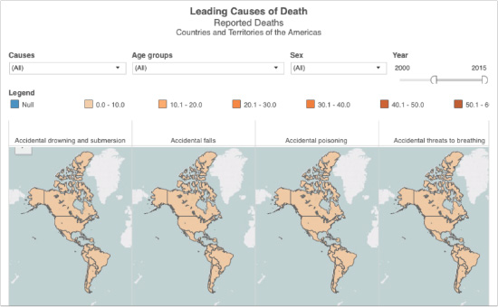
Current (Below):
This image of small multiple maps, the site’s third display, also needs some work. In the one shown, “All Causes of Death” has been selected.
The display is flawed in that
- although “(All) [Causes]” has been selected, only the top four are shown — and those are in alphabetical order, not in numerical order by frequency per country.
- This means that if the viewer is hoping to see the leading causes of death in each country, the format utterly fails to deliver.
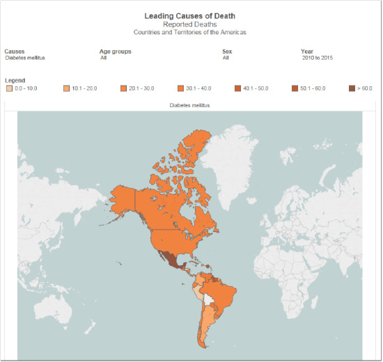
While a user can select a specific cause of death to generate a map, there is still no quick, easy way to determine the #1 cause of death in each of the countries for a given year (or years). In the view below, the user would have to
- select each leading cause of death, then hold that value in short-term memory (impossible: there are 67 causes) until the largest cause for the country of interest finally pops up.
- A user wanting to know the leading cause of death in each country displayed on the map would have to generate 67 different views of the map for each one to make that top cause display.
Proposed (Below):
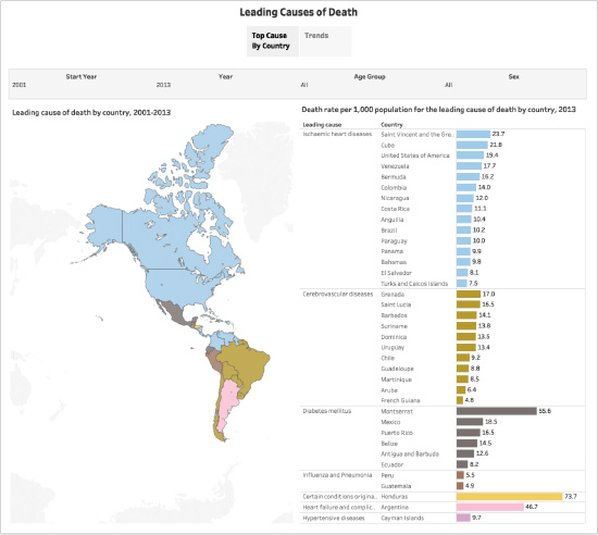
Now consider the view Cambria created. This map displays
- the top cause of death in each country and territory for the year[s] selected, displayed in a bar chart clearly organized by Leading Cause, Country and Rate per 1,000 People.
- All information is visible and graspable in a single compact, revelatory view.
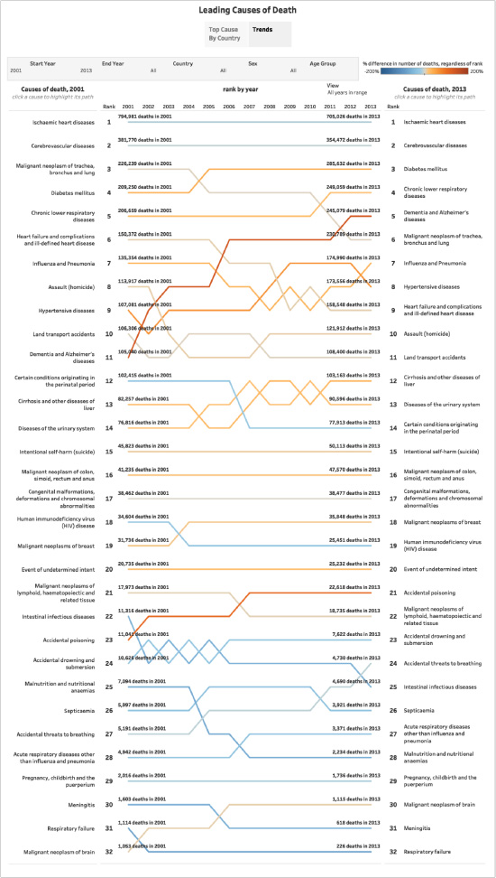
At the top of her display, Cambria has placed a button to call up trends for the leading cause of death by country, and show how those trends have evolved over time.
This view clearly displays
- for all countries the top ranked causes of death beginning in 2001, how each ranking changed, and where it stood for the last year selected, 2013.
For example, in 2001, Dementia|Alzheimer’s was the 11th leading cause of death worldwide; by 2013, it had risen to 5th — a perception both useful and sobering.
Final Thought
Here’s a tip about all of this.
A few simple case studies of what you believe that your displays’ end-users should be able to see and understand are extraordinarily useful during user-experience (UX) testing.
Everything I have said here could have been discovered via this simple technique, and would have driven crucial, transformative design changes. I have written in previous newsletters about the central importance of understanding why displays like Treemaps were created, so that you use them effectively.
Well, the snow has stopped falling and it’s time to find my way to a shovel while I imagine how beautiful my daffodils will be in a month. Hope — for splendid flowers and good design — really does “spring” eternal!


0 Comments