Read more about how the use of small multiples can help you to communicate complex data by using small multiples in my newsletter “Small Multiples — Big Clarity“.
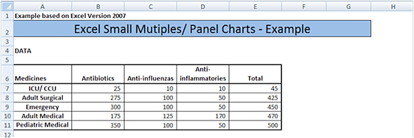
Regular Chart
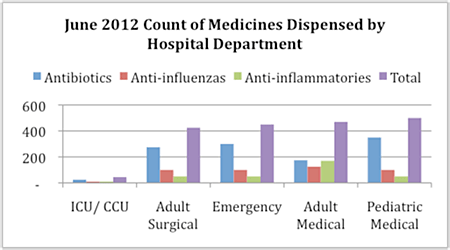
Making the Chart
Step 1: Create Antibiotics Chart. Select the Antibiotics data, by highlighting cells B6 – B11 above, and click the “Insert” tab above then in the “Charts” section click “Bar” and select “2D Clustered Bar”. Click “OK”.
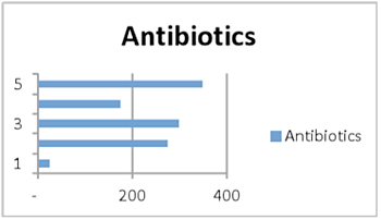
Step 2: Edit Axis Labels. Right click the graph and click “Select Data”. In the box titled “Select Source Data” in the right hand side of the pop up box you will see a box titled “Horizontal (category) Axis Labels”. Click the “Edit” button and a new pop up box will appear titled “Axis Labels”. Click the spreadsheet icon in the middle of the box and highlight cells B7 through B11.Click the icon on the right hand side of the box, which will bring you back to the “Select Data Source” box. Click “OK”.
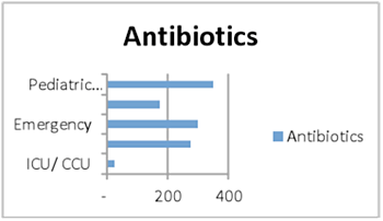
Step 3: Delete the Legend. Click the legend and press the delete key.
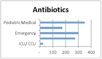
Step 4: Change Font Size. Right click on chart title and select “Font”. Change the font 8. Click “OK”. Follow this same procedure to change the x and y axis font to 8.

Step 5: Format Horizontal Axis. Right click the horizontal axis and click on “Format Axis”. In the pop up box “Axis Options” click on “Fixed” under “Minimum” and change the value to 0.
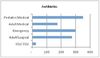
Step 6: Create Anti-Influenzas Chart. Select the “Antibiotics” chart and press CTRL +D to duplicate it. Move that chart next to the original Antibiotics chart. Right click inside the new chart and click on “Select Data”. A pop up box titled “Select Source Data” will come up. Under the “Legend Entries (series)” side of the box click on the “Edit” button. A pop up box appears titled “Edit Series”. In the “Series Name” section click the spreadsheet icon on the right side and highlight cell D6 for the “Anti-influenzas” title. In the “Series Value” section click the spreadsheet icon on the right and highlight cells D7 though D11 (Anti-influenzas data). Click “OK” and “OK” again.
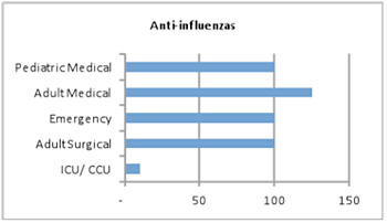
Step 7: Create Remaining Charts. Repeat step 6 for the Anti-inflammatories data.
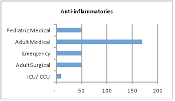
Step 8: Repeat step 6 for the Total data.
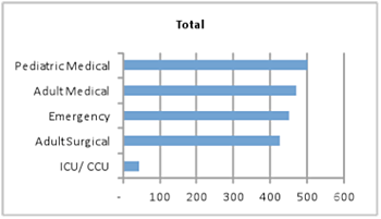
Step 9: Align the Charts. You now have all the panel charts completed and can begin to align charts. Click the Total chart you created in step 8 and press the CTRL key + D. Now move that chart to where you want. Click the Antibiotics chart and press the CTRL key + D and move that chart right next to the Total Chart. Repeat this process for the Anti-influenzas chart, and the Anti-inflammatories chart. Right click the horizontal axis in each chart and click “Format Axis”. In the pop up box “Axis Options” click “Fixed” under “Maximum” and change the value to 500.

Step 10: Format Horizontal Axis. Right click the horizontal axis of each chart and click on “Format Axis”. In the pop up box “Axis Options” click “Axis Labels” and select “High”. Click “Close”.

Step 11: Clean up Chart Junk. Right click in each graph on the vertical grid lines and press the delete key.

Step 12: Add Title and Borders. To add title across the top of the graphs highlight cells A55 through L55 (in this example) and click the “Merge and Center” icon in the “Alignment Tab” above. Then click the “Fill” icon in the “Font Tab” and change to whatever color you like to create a border. Now in that cell type the title of the charts: June 2012 Count of Medicine Dispensed by Hospital Department.


0 Comments