Whenever I teach my “data visualization best practices” courses, I always include an introductory overview about mental models – an explanation of a person’s thought process about how something works in the real world. I do this because understanding mental models can help us construct an effective approach to solving problems and accomplishing tasks.
First, I ask course participants to think about, then describe, how they read a printed book.
The responses always include such observations as, “I look at the Table of Contents; then I turn the pages from right to left. I read the words on the pages from left to right and top to bottom. If a passage holds particular interest, I often underline it; if I come across an unfamiliar word, I sometimes look it up in a dictionary.”
Once we have gone through this exercise, I ask how they read a book on a Kindle or other electronic device. Their responses are almost identical to the first set. Turning pages and text exploration are faster and more effortless on an e-reader (if less tactilely satisfying) – but they are essentially the same processes.
Next, I ask them to weigh in on how successful they believe Amazon would have been had its designers created an e-reader that required people to process a book in an entirely new way – for example, by starting on the last page, turning pages from left to right, and reading from bottom to top. How many of you, I ask, would have even considered reading on a Kindle? Not a single hand is ever raised.
This simple, familiar example makes the point: it’s really difficult, if not impossible, to get people to change the way they think about doing something – especially when that way is familiar, and works.
As a result, the importance of uncovering and understanding the mental models of the viewers of our dashboard and reports – the way they use data and information to support their work – is essential to designing and building something of value. Quite simply, before we ever sit down to our design work at a computer screen, we must endeavor to learn as fully as possible the process by which our internal and external customers use data to make decisions about the work they do.

Let’s consider a simple example: post-discharge referrals to home health care providers by a local hospital.
How might a discharge or case manager think about – what is the mental model for – determining which patients to refer for services and where to refer them? It is highly likely (and has been confirmed based on previous work analyzing one such group’s mental model) that these managers think about and want to know the answers to such questions as:
- are all patients who could benefit from home health care services – say, patients who might be at increased risk for readmission within 30 days – receiving referrals to them?
- which providers are geographically closest to a patient’s home?
- how well do different agencies perform by quality-of-care measures?
- how do patients rate different agencies on satisfaction surveys?
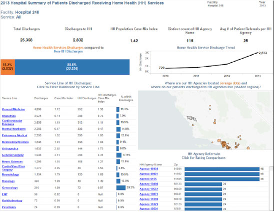
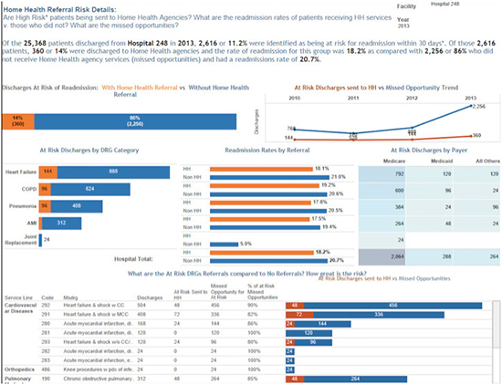
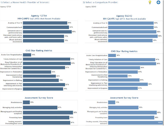
Using the questions gleaned from our example discharge or case manager’s mental model as a guide, we created the following three interactive dashboards to display, highlight, and clarify data in alignment with these questions.
The first dashboard filters for a particular hospital and desired date. The top section displays summary metrics that drill down by hospital service line. The map pinpoints the ZIP code locations of home health agencies with referrals, while a bar graph quantifies referrals per agency. Each Provider Name is a hyperlink to the Home Health Agency Comparison dashboard.
On the second dashboard, “At Risk by DRG,” is a summary narrative capturing statistics on missed opportunities – that is, concerning patients who may be at risk for readmission and for whom home health care may help reduce that risk; a visual trend line highlights these figures. Additionally, the data displays categories, and drills down to a specific DRG level. To the right is a payer heat map that uses color to identify those at highest risk.
“Home Health Agency Comparison,” the third dashboard, shows – with an easy-to-use, side-by-side comparison tool – how HHA’s perform on publicly reported quality metrics.
Far too often we blame ourselves when we fail to grasp how something new to us works, or can’t make any sense of the information we have been given in a dashboard or report. Most of the time, though, we are not to blame. Rather, the product designer or data analyst has failed to understand our mental model – the way we interact with or think about things in the real world. We end up looking for this:

And worse than banging our heads against the foolishness of paying for and being handed something we don’t want and won’t use is the inevitable result that we will simply revert to what we know: a book printed on paper, or an Excel spreadsheet – thereby missing the potential to do more and see better in a new and exciting way.
And wouldn’t that be a shame?
P.S. To view all three of these examples as interactive dashboards, click here.


0 Comments