Six Easy Tableau Formatting Tips to Save You Time
Best Practices
Dashboard
Tableau
The Impact of Sharing Data with the DC Community
Hospitals
Public Health
Showcase/Case Study
DC Health Launches Two Key Public Health Dashboards
Case Study
Mapping
Public Health
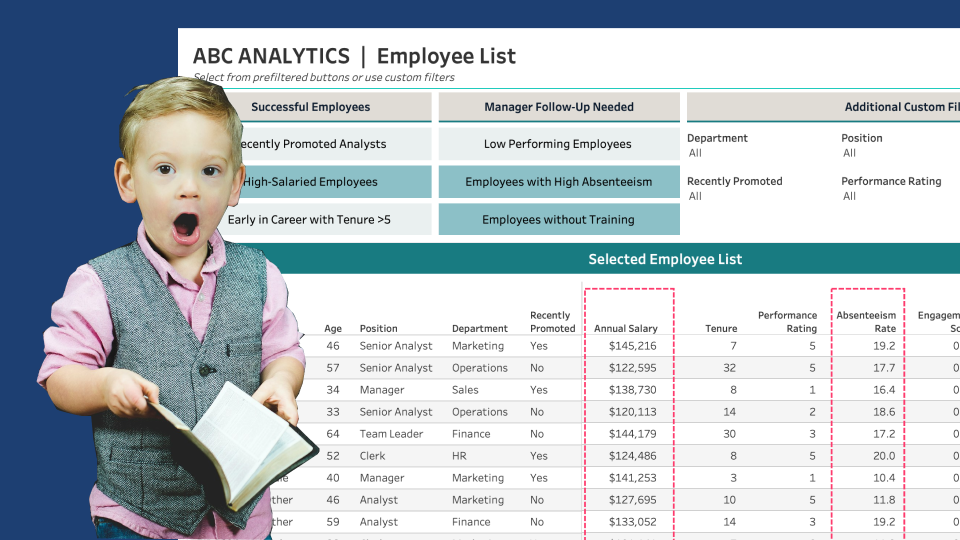
Custom Lists with Parameter-Driven Filter Buttons
Advanced Techniques
Tableau
Tutorial
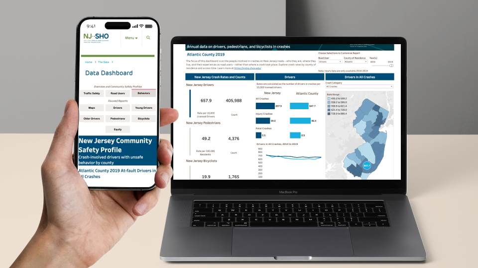
Designing Mobile-Friendly Dashboards: A Case Study with NJ-SHO
Accessibility
Case Study
Design
Five Star Rating: Usability Testing for Data Visualizations
Design
Prototyping
Usability Testing
Create a Reset Button for Dashboard Filters & Sets
Advanced Techniques
Tableau
Tutorial
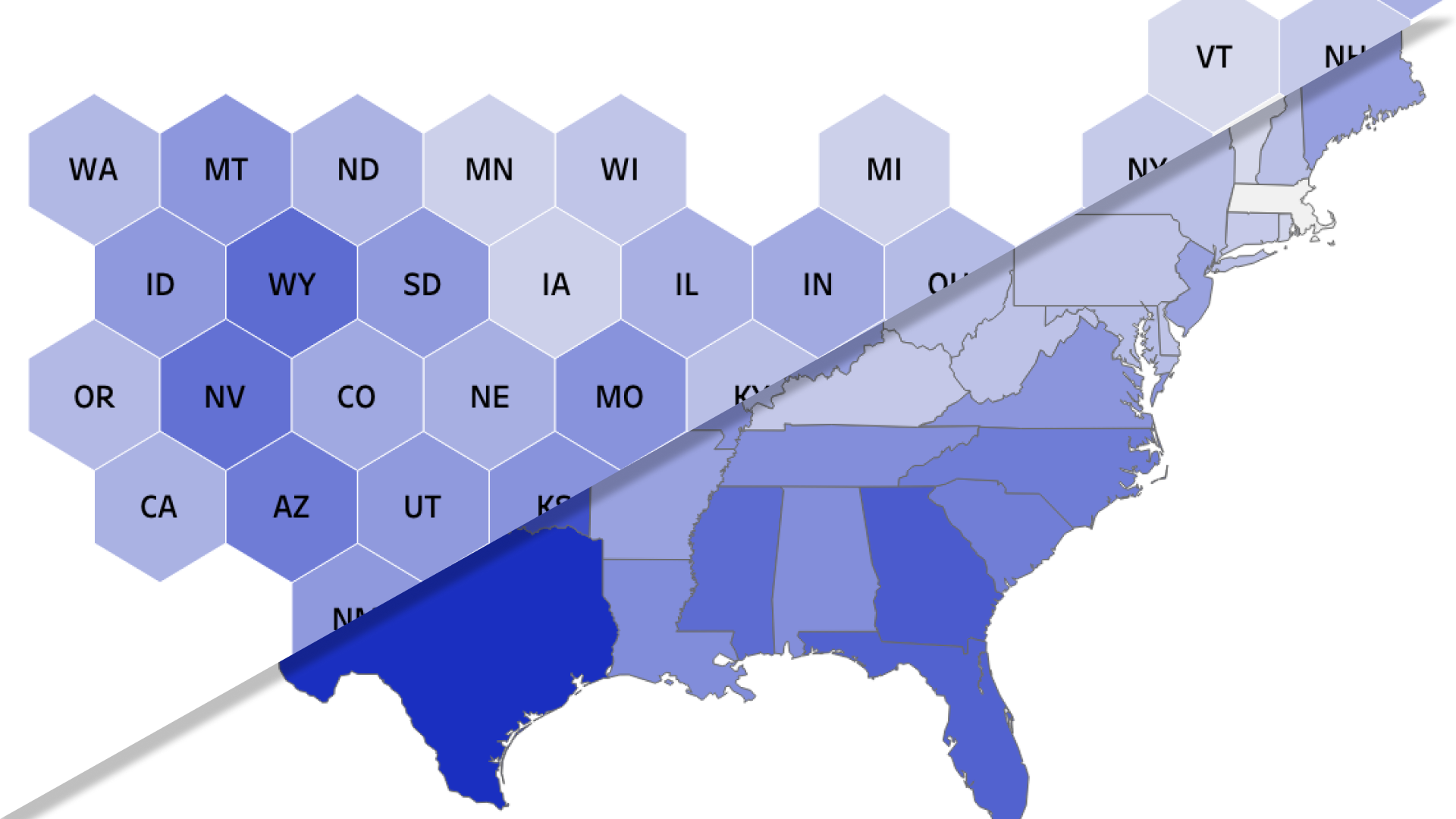
What the Hex?
Chart Types
Mapping
Showcase/Case Study
Improve the UX of Tableau Filter Selections with a Dynamic Error Message
Advanced Techniques
Tableau
Tutorial
Using Dynamic Zone Visibility to Enhance Dashboard Filter Options
Advanced Techniques
Tableau
Tutorial
So, you’ve won the lottery, now what?
Design
Theory
Exploding Pie!! But Why??
Case Study
Design
Figma
Alternatives to Stacked Bars
Best Practices
Chart Types
Fundamentals
Prototyping: Building Better Dashboard Designs
Best Practices
Design Thinking
Prototyping
Why Constraints Make You a Better Designer
Case Study
Consulting
Design
A Lesson from My Dog: Correlation vs. Causation
Analytics
Healthcare Metrics
Theory
Design Thinking Required
Design Thinking
Theory
Clever Ways to Use Indicator Icons
Advanced Techniques
Tableau
Tutorial
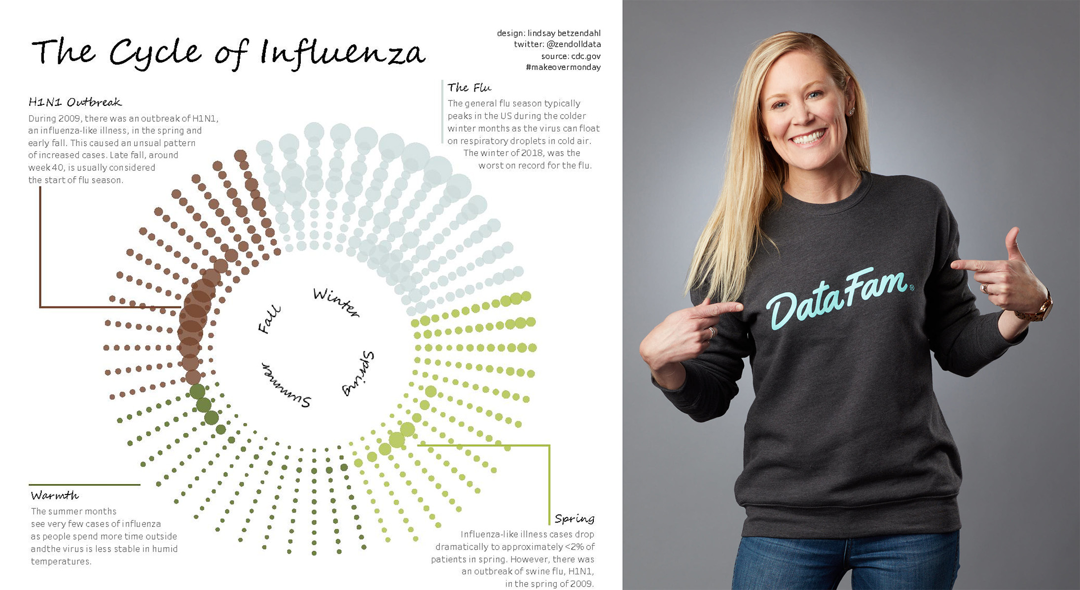
“My Tableau Story” with Tableau Visionary Lindsay Betzendahl
Career Growth
Community
Leadership
Two Must-Read Health Equity Books
Health Equity
Public Health
Look Here! Effective Use of Icons
Accessibility
Best Practices
Fundamentals
