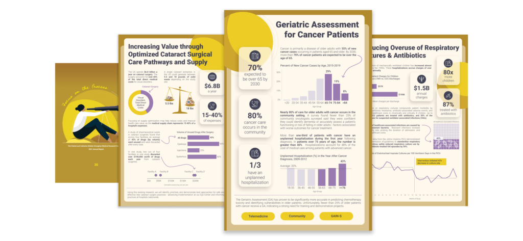
For the past five years as a consultant at HealthDataViz, I have worked with Connecticut-based organization The Donaghue Foundation to design and develop infographics for their annual reports. The organization funds research that promotes knowledge of practical benefits to improve health. Each year, my job was to review curated information pulled from awarded grantees’ research proposals, including data from research articles supporting each project, and extract relevant data into individual summary infographics. Historically, the Foundation used the infographics in their printed annual report, as shown below for the 2021 annual report.
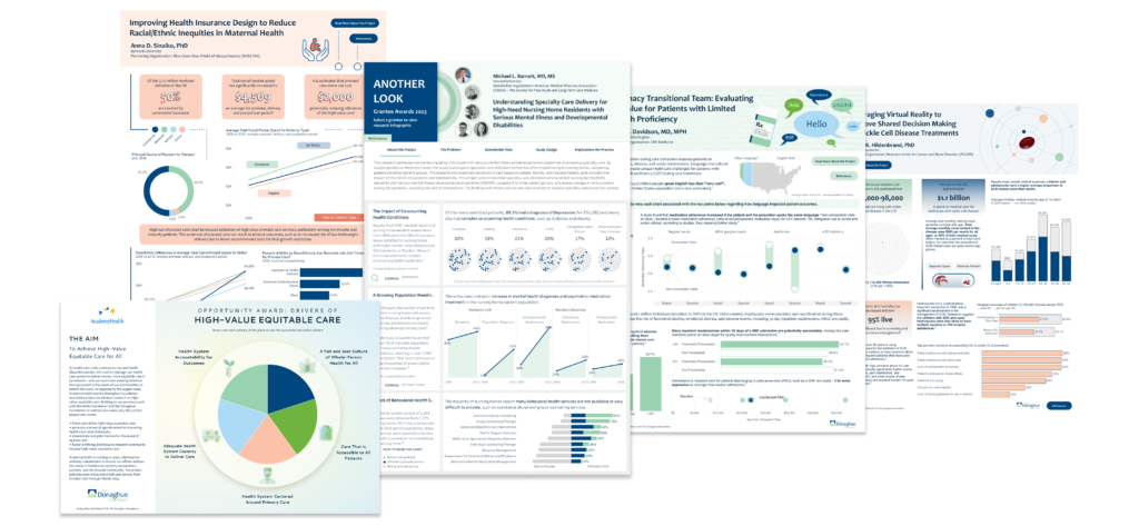
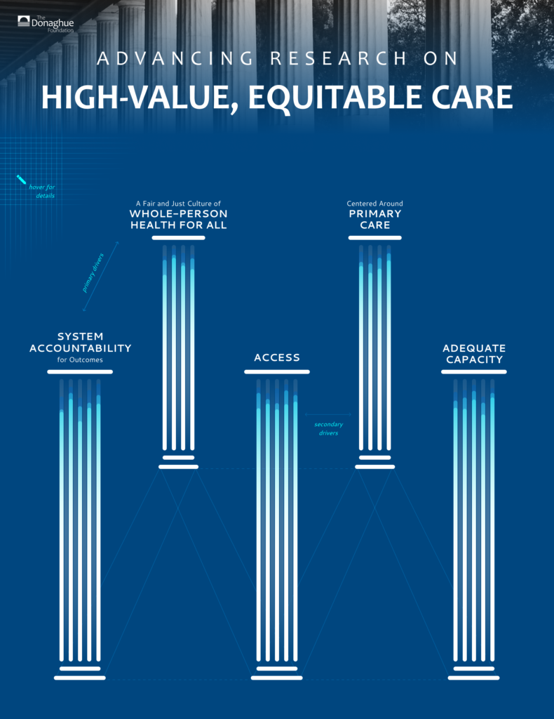
However, in 2023, The Donaghue Foundation wanted web-based interactive infographics for the 2022 report. The engagement included developing eight (8) infographics – one for each of the seven (7) grantees and one summarizing their Opportunity Awards and the drivers required to achieve high-value, equitable health care – seen in the image below of the final infographics.
Most of these visualizations utilized data from articles cited in the grantees’ research proposals, which I cleaned, analyzed, summarized with text, and supported with clever designs to engage readers. However, the final infographic was a bit different as it didn’t have “data.”
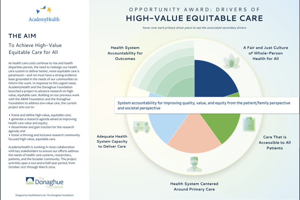
The final dashboard visualized the Donaghue Foundation’s strategy for achieving high-value, equitable health care. The strategic aim consisted of five (5) categories, or “primary drivers,” and the 3-5 “secondary drivers” within each category. The challenge was unique – I didn’t have measures that could be easily displayed in common charts or graphs such as bars or lines. Yet, the infographic still needed to be interactive and data-driven like the other infographics for this project, requiring a novel approach to data visualization.
So, what the heck was I thinking when I decided to design and create an exploding pie chart for the final infographic? Aren’t pie charts (especially exploding ones) a big “no-no”?
Let’s be honest – it’s rare that my first design is the final design. In reality, I go through many iterations of my ideas and may even completely scratch an idea and start over. All to say, this design took a lot of trial and error and thinking outside the box.
Getting Creative
Initially, I searched for visual designs where categories stemmed out (like a network diagram or wheel spokes) to show the parts that made up the whole. I knew I needed some way to visually group the secondary drivers and perhaps show the details as text. I found the Tree of Life visualization by Muhammah Azhar, which got me thinking about curvy lines.
Using bubbles and Sankey charts, I displayed the primary drivers as circles with the secondary drivers within them, followed by a visual flow (Sankey) to the actual individual names. But this was a lot visually and too abstract for the client. So, scratch that idea.
Scratch That
The client suggested a “pillar concept” for the drivers. Onto design #2. Using that visual idea, I reorganized the bubbles into columns where upon hovering, the secondary driver names would appear. This new design had a completely different look and feel – more formal than the first.
This one still wasn’t the winner. Scratch this idea too…
The client liked parts of the initial design and suggested adding icons, removing the text, and using the hover (tooltips) for users to explore the primary and secondary drivers. Okay, so I felt a bit worried I wouldn’t crack the case, but here’s when it’s important to not get too attached to designs or ideas. I often remind myself that never has iterating on a design failed me – it always ends turns up better each time you consider what works, what doesn’t, what should stay, and what ultimately needs to be left on the chopping block.
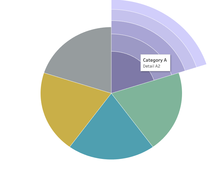
As it would go… After much trial and error, I landed on created a pie chart design to show the five (5) primary drivers, each with a simple icon and the driver’s name. But that was only half of the information I needed to visualize. How would I make the secondary drivers an interactive component of the visual design?
Insight Into My Idea Development
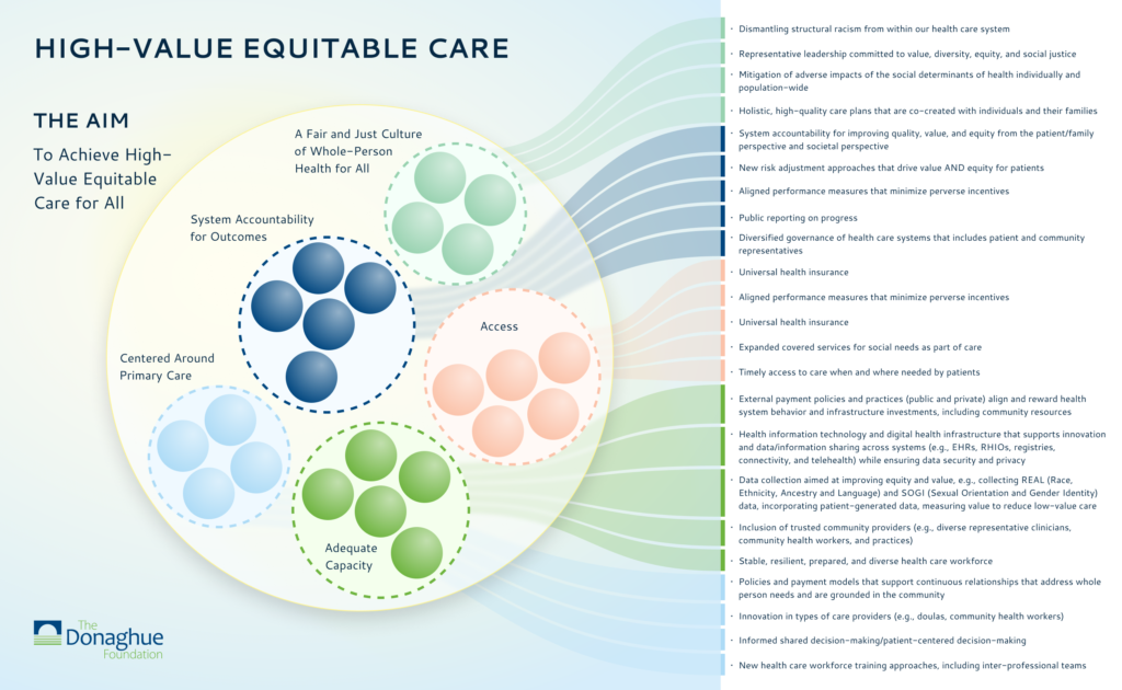
It was at this moment that I remembered a personal viz I did about my son’s terrible sleeping the year after we moved our family across states. I designed and built a Coxcomb chart (think Florence Nightingale’s rose diagram) to show each sleep segment within a night. The gray portion is the time from falling asleep until his first wake-up, purple is the time between when we got him back to sleep and when he awoke again, and so on for each colored segment.
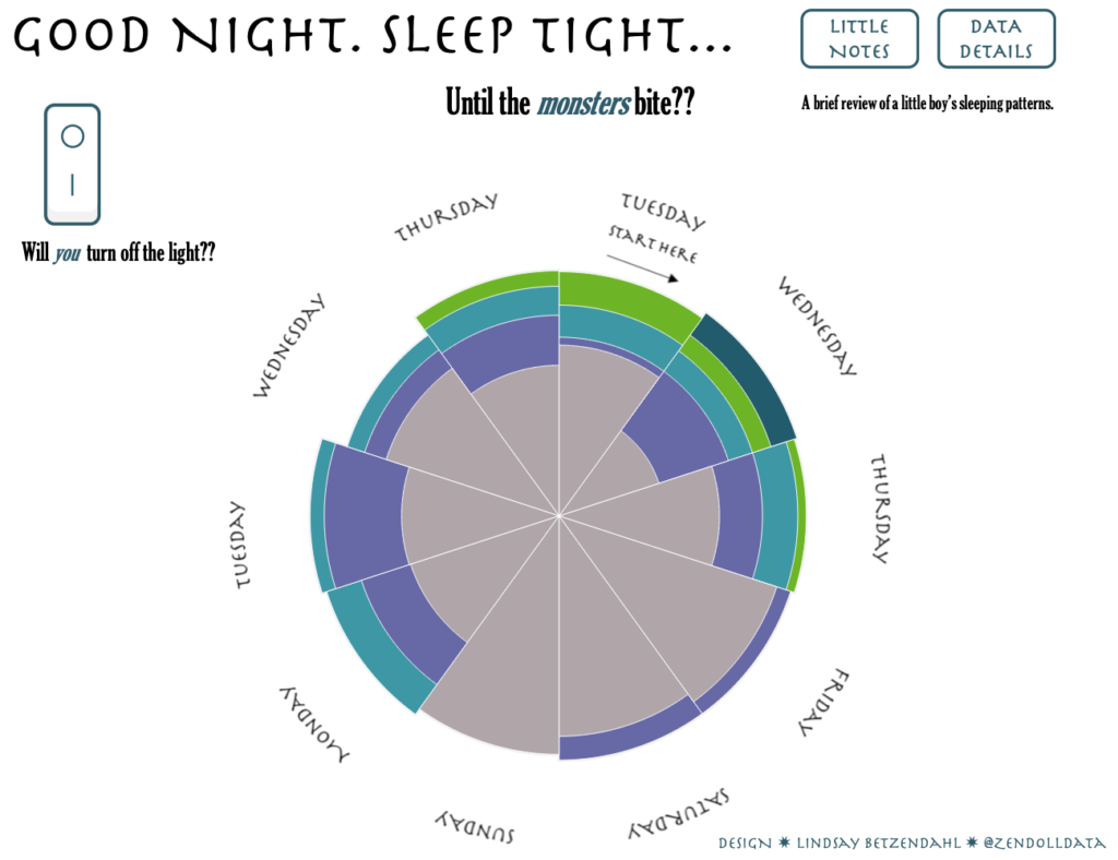
Coxcomb charts use polygon marks in Tableau and require data preparation and complicated calculations. Thankfully, since I had built this chart before, I had the bones already by which to reference when attempting to replicate the concept with the infographic.
However, remember, I didn’t have quantitative data, so technically each slice would be the same size if I took this exact approach, and the interactivity would only be hovering. I wasn’t satisfied with how I envisioned the end design.
But then I a new idea started to grow…
Exploding Pie Perhaps?
What if the concept of the Coxcomb chart (slices of different lengths) appeared upon hover to show the secondary drivers? What if the slices visually expanded—or exploded out!!
Now, this got my creativity into overdrive!
Opening Tableau, I set to work on how to make this idea a reality, and I didn’t stop until I achieved my vision. I’ll admit that this idea probably took too long to think through and test. Still, in the end, the Donaghue Foundation was ecstatic with the final design, and I felt quite accomplished for coming up with and successfully implementing my exploding pie chart idea. Below, you can see the example of the “explosion” and the tooltip displaying one of the secondary drivers within the selected primary driver.

Creativity Comes with Iteration
Your first design likely won’t be perfect. In fact, the client might dislike it. It might need rework, edits, modifications, or a complete overhaul. Iteration is simply a necessary part of the design process and, frankly, a source of creativity in both design and dashboard visualization development. I recommend learning from each design you create – take the feedback as an opportunity to challenge your designs and force yourself not to get too attached to any part of what you have created. The more you can “scratch that, start again” and allow your mind to be open to new ideas, the better your designs will become.
If you want more information on the techniques I used to create the “exploding pie” chart, check out my personal blog, where I explain all the nitty-gritty details.
But remember, creating pie charts comes with great responsibility. I would not recommend using this chart for decision-making or data analysis purposes. However, I do recommend embracing challenging design requirements and using them as fuel for your creativity.


0 Comments