Stacked Bar Chart or Some Other Display?
As with all charts, we need to think first about the different types and characteristics of the data we are working with before deciding on the most appropriate chart type.
We can ask questions such as:
- Are we seeing a time series?
- An interval?
- Nominal data?
What do we need to tell our viewers? Do we need them to:
- Understand the distribution of the data and if it is skewed?
- See how the data is trending over time?
- Compare the parts of a whole or the sum of two or more of the same data parts for different groups?
Once we have considered both our data type and our message, we can confidently select the right chart design for the job.
Visualizing the Data Distribution
In healthcare, we commonly need to show the age distribution of a group of patients clearly. Visualizing the count of patients across interval scales by age shows, for example, the distribution of a disease or condition and quickly identifies if patients are normally distributed or skewed towards younger or older patients.
Suppose we use a horizontal stacked bar chart, as in the first chart below (with the X mark). In that case, it is challenging to compare the age groups quickly, and identifying the shape of the distribution is nearly impossible. Compounding this problem is the use of color, such as the shades of blue and grey, which are very similar but show different percentages. For example, in the first chart below, the age group 10-19 years (21%) is displayed in grey, as are the 60-69 age group (4%) and the 80+ cluster (1%). The appropriate way to display the age distribution of the population of interest is with a histogram like the second chart below (with the checkmark).
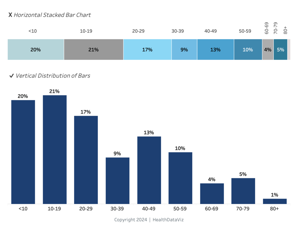
Displaying the data in a vertical histogram makes it easy for the viewer to compare the values in the different age categories directly by looking at the height of the bars and to understand whether the patients are skewing younger (as in the display above) or older.
Stated another way, a histogram is perfectly designed to enable us to compare the bars’ size and see the data’s shape and direction.
Trends Over Time
Another mistake people make is using a stacked bar chart to display trends over time for different parts of a whole or a category of data, as in the chart below.
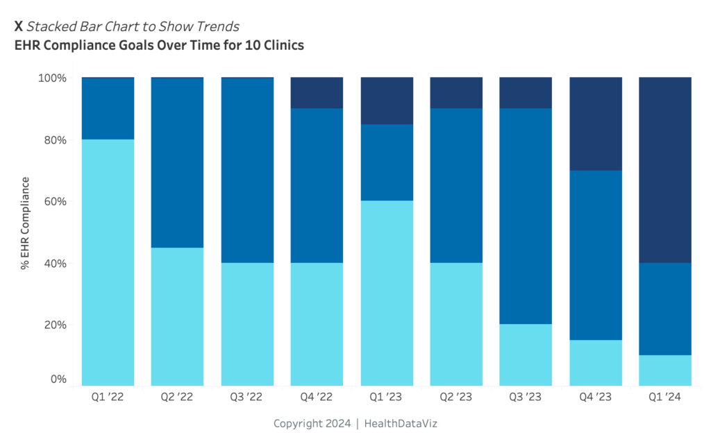
Unfortunately, this approach permits accurate viewing and interpretation only at the very bottom or first part of the stacked bar (starting at 0). A viewer cannot accurately or easily see how categories change over time, because each part of the bar begins and ends at a different place on the scale.
To correctly interpret what they see in such a design, the user must do a mental calculation – or more like some math gymnastics – involving the beginning and end points of each section of the bar, for each timeframe.
They must then hold those pieces of data in memory, while simultaneously trying to understand how the data has changed through time and comparing it to the same information for all the other sections of the bar. Merely describing this onerous process makes me tired.
The best way to show trends over time is with a line graph like the one below.
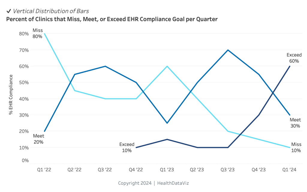
Such a graph allows the viewer to see whether something is increasing or decreasing, improving, or getting worse; and how it compares to other parts of the whole. I have been challenged a few times by folks who believe that the stacked bar chart is better suited to showing that the displayed data is part of a whole; however, one can highlight that aspect easily by labeling the chart and lines clearly, as in the example above.
Comparing Parts of a Whole and Sums of Parts
At this point, you may be asking, “Okay, when is it appropriate to use a stacked bar chart?”
Well, let me tell you. Whenever you need to show two – and two only – parts of a whole, a stacked bar chart does the trick quite nicely, and can also be a space-saver if you have limited real estate on a dashboard or report. The display works well precisely because the viewer doesn’t have to do the math gymnastics described above: the two parts can easily be seen and compared.
Depending on the layout of a report, you can play around with vertical or horizontal bars as in the two displays below to determine what will work best for your specific report or dashboard. I often prefer to use horizontal bars, because they allow me to place my labels once and add additional information in alignment with the bars (such as figures or line graphs) to show trends over time.
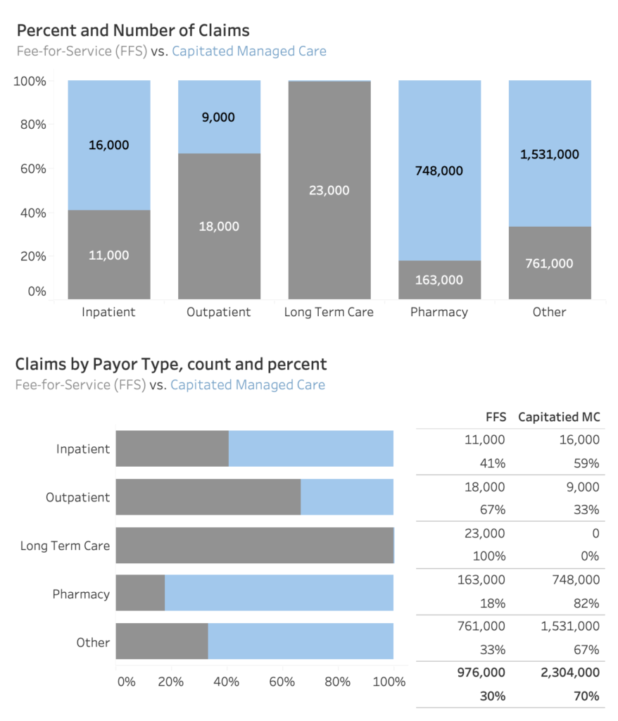
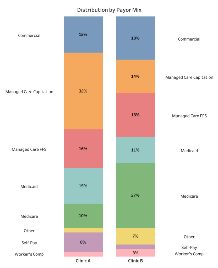
However, trying to compare the sum of parts using side-by-side stacked bars generates yet another problem. As I have said, it is very difficult to understand how big each part of the bars is, never mind comparing one bar to the other meaningfully. And the piling on of different colors, as in the graph below, is just distracting because it requires looking back and forth between two as we try to hold colors and numbers in our short-term memory – a task none of us is very good at. More likely than not we give up this cumbersome task, and the message is lost.
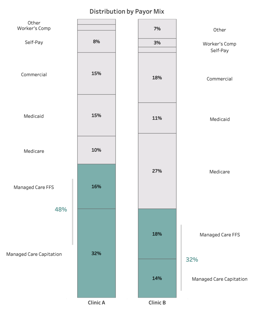
There is an alternative way to compare the sum of the same parts shown above using a stacked bar chart but with a few minor modifications that have a big impact on data interpretation. In the following graph, we can compare different clinics’ payor mix (for the same payor groups) with a stacked bar chart like this:
In this example, it is important to note that both bar charts are arranged in the same order by payor, and the two payor groups to be compared (in teal) are at the very bottom of the charts. This design permits an effortless grasp of beginning and ending points. Here, the use of color separates those parts from the others, drawing the viewer’s attention to the comparison to be understood.
And finally, one more approach I have come to love: combining a heat map table with marginal histograms.
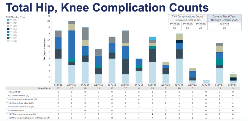
In the following example a stacked bar chart is being used to try and display eight different types of complications for a specific type of surgical procedure and how they have changed over time. As described above, when there are more than two parts to a stacked bar, it is simply impossible to interpret each part’s size and compare it from one point in time to another. To solve for this problem, the detailed data is also presented in a table below the chart for users to review.
So, how might we improve this display?
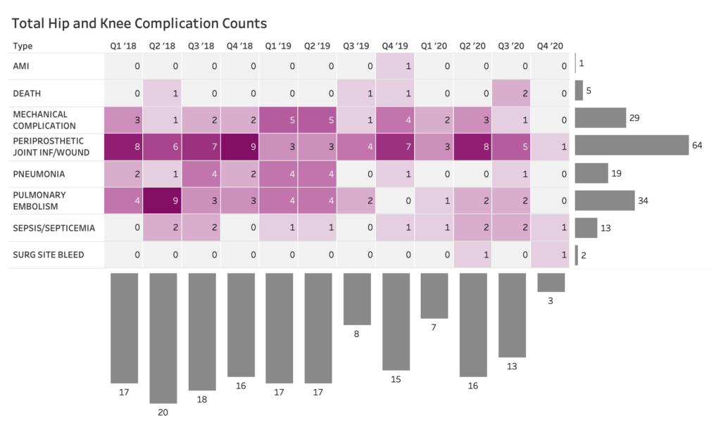
One technique can be to use a heat map table to highlight values between two categories, such as complication type and quarter/year, as seen in the chart below. Color encodes the value where the darker saturation of represents higher values, and the lighter shows the lower values. That is straightforward. But what transforms this view is the addition of marginal histograms to show the distributions in the data that are hard to see using just the heat map table.
On the far right of the table, the histogram helps the viewer see that Periprosthetic Joint Infection/Wound (#4) is the most frequently observed complication and AMI (#1) the least frequently observed. Additionally, we can use the same technique on the bottom of the table to display the trend of all complications from quarter to quarter. By combining these techniques, we can see the details in the table, the distribution of categories (complications), and quarterly trend that we could not see in the previous multi-part stacked bar chart.
In Summary
As with all data visualization, the goal is to create charts and graphs that help people see the story in mountains of data without doing math gymnastics, color-matching, or anything else that strains not-always-reliable (and always over-taxed) short-term memory and pre-attentive processing.
Bottom line? Stop and think about the type of data you need to communicate, what you want your viewers to consider, and the best data visualization to accomplish these tasks.
Be sure to check out the accompanying Tableau dashboard created by Senior Consultant, Lindsay Betzendahl, to see all the examples mentioned in this post.

0 Comments