Cliffs and Bears… OH MY!
This past August my husband Bret and I were hiking in Cape Breton Nova Scotia when we came upon the following signs:
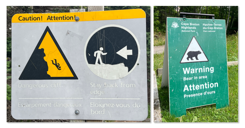
You might think this would cause me, someone who is wildly afraid of heights and hungry bears, to consider different vacation options, but when I saw these views, I was just happy.
A big reason to go on vacation is to get out of the office and not think about work for a while, but, of course, the signage with the icons of the guy falling over the cliff (most likely as he is being chased by the bear) made me think about iconography and how we utilize it in our data visualization work.
While on another hike with Bret in the woods, we happened upon an old cemetery and an antique gravestone. Finding an old cemetery in the woods is interesting, but it was the relief on the gravestone of a finger pointing toward the heavens that really caught my attention. Was this an instruction for those who would be helping this man, John Young, into his next life, or simply a message left for all of us earthbound souls about where he had gone — a reassurance of sorts? No matter – it amused me immensely and made me think about the directional icons we use in data visualizations.
Dead people, data viz icons… don’t even try to imagine living in my head.

Grabbing Attention with Icons
We sometimes use icons in our data visualizations to grab a viewer’s attention and direct it toward something important or that requires action. Icons alert the viewer to “see this,” or say in clear, firm tones, “this is urgent; do something!”
The icon shapes we use most often are up- and down-facing carets to show that one measure is greater or less then another (for example, actual performance compared to target or budget), or — in the case of a performance over time — the way something is trending.

Depending upon what result or direction is desired, color may be applied to the icons – perhaps red for an undesirable value and green for a desirable one. A word of caution here, you must think through the use of these types of icons very carefully. If different measures with different directionality of good vs. bad are displayed together, the mix may cause confusion for all viewers.
Yes, we often discourage the use of the colors red and green together, because about 8% of the world’s population is red-green colorblind; but if it makes sense to use this type of icon for those who are not, go ahead. The 8% can still perceive the directionality conveyed by the carets.
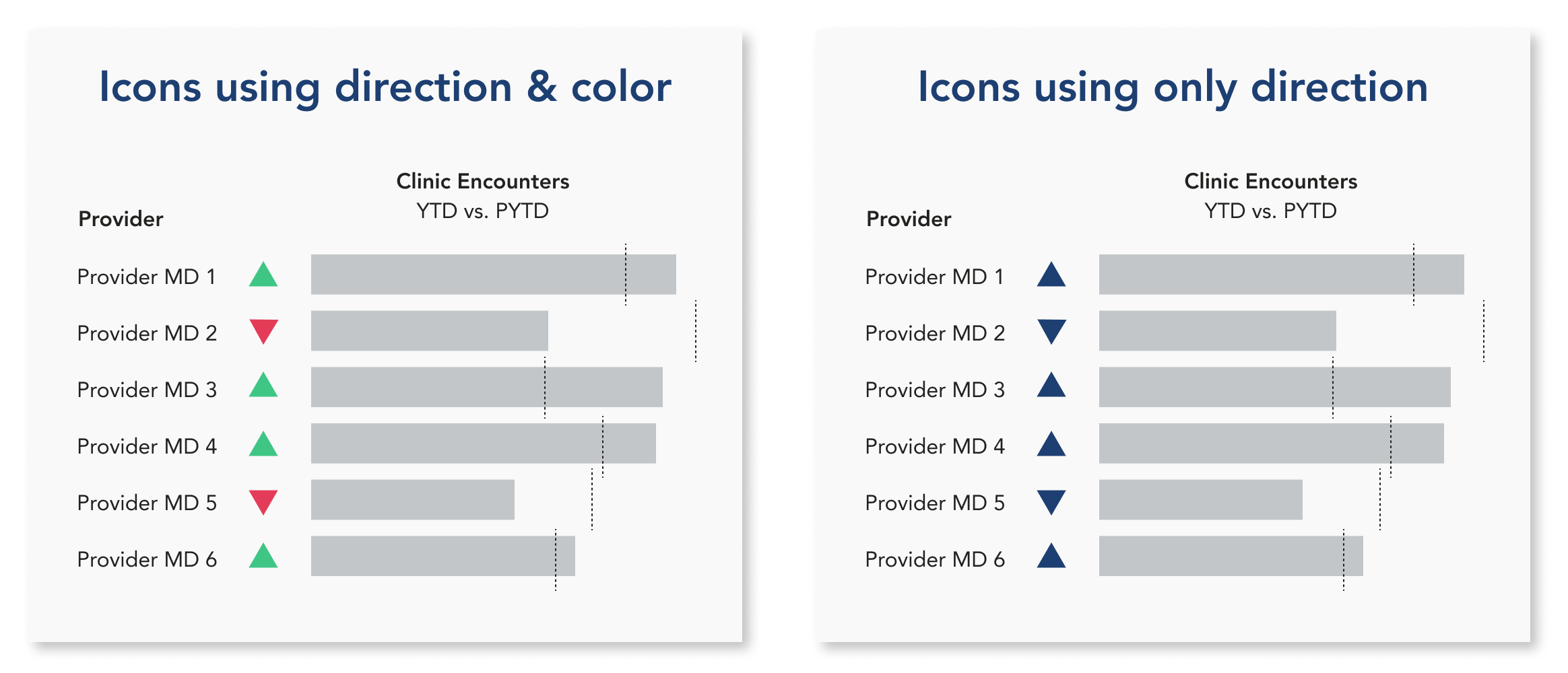
Keep in mind, of course, the above-noted problem of mixing metrics with different performance goals.
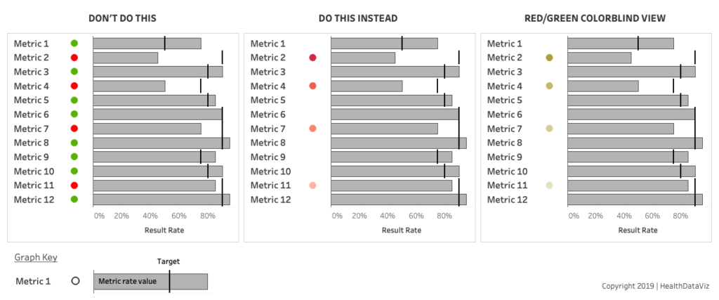
If we don’t want or need to show directionality or greater than or less than specifically, we simply use points and different saturations of a single color (usually red) to signal degrees of difference between one measure and another — to tell the viewer where to look first, beginning with the deepest saturation, then moving to the next and the next.
While it’s true that red-green color-blind people can’t see the red color on these icons, they can perceive a shape that signals “look here.” They can see saturations of color from deepest (most urgent) to lightest (relatively less urgent).

We do NOT, however, use green and red points together for several reasons. First, the purpose of a true management dashboard isn’t to pat anyone on the back with lots of green points that signal “good job!”; rather, we need to keep our displays uncluttered and use this type of icon only to call out and highlight areas of concern.
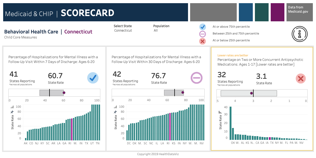
Another example of how we’ve used icons to communicate and draw viewers’ attention to a specific performance in comparison to percentiles is shown in the following display of State Medicaid agency results on Behavioral Health Care metrics. Here, we’ve used both shape and color to convey information.
A blue checkmark indicates performance at or above the 75th percentile. The purple minus sign in a circle for performance falling between the 25th and 75th percentile is somewhat neutral. The “Hey! Look here: this needs immediate attention” 25th-percentile-or-below results icon is a red x.
There are also occasions when you should not use any color conveying good to bad performance on an icon. For example, you simply way to communicate that a value has increased or decreased. The viewer’s knowledge of the metric is required to determine whether that change is a good or a bad thing.
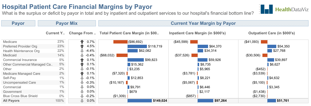
The following illustrates what I mean. The arrow icons show only that a hospital payor type has increased or decreased from one year to the next. Given the complexity of hospital contract and reimbursement, we don’t have enough information to decide what is good or bad for this hospital, so we don’t use a signifying color. We leave that judgement to the contracts and reimbursement experts who work there.
After seeing John Young’s gravestone, I got to wondering about some of the other icons that exist in our day-to-day world. Is the up arrow in the image below pointing to the heavens, or merely showing me the way to my meeting on the 8th floor? Let’s hope it’s the latter!

Want More?
For more information on using icons in Tableau and some clever techniques, check out Lindsay Betzendahl’s blog post.
