This past Sunday I attended the annual IEEE VisWeek Conference and saw some truly beautiful data visualizations. Mind you, I am talking cutting edge, “just how brilliant, and yes, geeky, are these engineers,” kind of visualizations.
And, although I understand that life is full of paradoxes, I wasn’t prepared for the 3D graphs and 3D pie charts (horrors!) that I also saw at the conference.
This was distressing, because it is well documented in the literature that 3D displays of quantitative data simply do not work. Never mind the literature, you can simply look at these displays and know that they are lousy.
As luck would have it, just as I was recovering from the shock of bad 3D at VisWeek, not one, but two of my newsletter subscribers (you know who you are) sent me examples of charts rendered in 3D.
Now, before I tell you about why 3D doesn’t work for the display of your data, let me say that some data and images displayed in 3D are fantastic. For example, MRI images of the brain are beautiful and have helped advance research and medical care by light years. But this is not the type of data we work with every day, this is not the information we are communicating. Rather, we work with quantitative data, upon which people rely to make management decisions, patient care decisions and decisions about where to receive their medical care.
Here is the first example that I received this week. This is the actual view — do not adjust your screen — of a project time tracking report. Notice how hard it is to tell the difference in the height of the bars and quite frankly how downright silly this is.
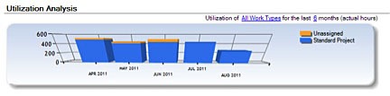
You can’t tell what the value for August, 2011 is … actually, you can’t tell what any of the values are for any of the months, or for the yellow portion versus the blue. How can anyone understand what is being communicated? They can’t.
The second example is one that is available publicly on the CMS Hospital Compare site. Notice the way the grid wraps around the chart and is displayed on an angle. Again, this takes way too much work to understand, “what is going on.” What should be a simple bar graph is too “clever” and cluttered with labels that would be unnecessary if the graph was constructed correctly.
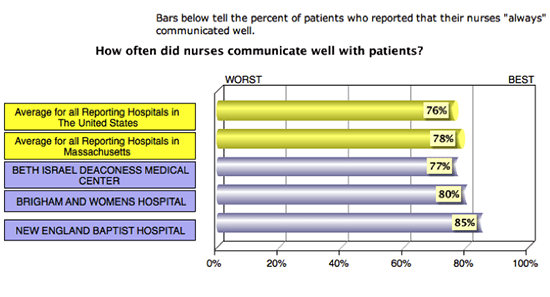
A simple 2D bar graph with the X Axis noted in increments of five (5, 10, 15 etc.) would make it easy to see how well sites are performing on this measure and would eliminate the need for these data labels on each bar.
And seriously — what value does 3D add? None, zip, zero, zilch.
It is easy enough to see with our own eyes that these 3D displays don’t depict information very accurately, but it is more difficult to understand why people persist in using them.
I’m certain that a large part of the motivation for people to display data in this way is that they believe it looks “cool” and they wish to “impress” the viewer.
But there may be another extraordinarily interesting reason contributing to this behavior.
In a 1999 study about how people decide to present data, the researchers Tractinsky and Meyer asked study participants to choose a display that would be best suited for viewers to “understand what is going on.” They found that participants preferred 2D graphs as an aid to making decisions, both when they were making the decision themselves, and when the graph was to be shown to others who were making the same decision.
Now here is where it gets interesting.
The researchers also found that participants preferred to use 3D graphs when they believed the data were unfavorable. Tractinsky and Meyer interpreted this preference as a kind of compensatory behavior, in which the presenter is trying to show that he or she is competent even in the face of bad data.
Think about that.
Could it be that people look for ways to “put lipstick on the proverbial pig of bad data?”
Perhaps.
Unfortunately, I feel pretty certain that people believe they are making the data look entertaining, they want to jazz it up, show that they can do funky things with the software … but it is just making their data displays worse.
Here is the bottom line. Stay away from 3D effects when you are creating graphs…they just don’t work. And if you are trying to cover up bad data and poor results forget it … this data NEEDS to see the light of day…otherwise, how will anything ever get better … ever?


1 Comment
Give Your Y Axis a Break | Katherine S. Rowell & Associates · August 20, 2013 at 4:20 pm
[…] of data displayed in 3-D, and ran through a few of the reasons that you should avoid using it. (Get the full story in my November 4, 2011, newsletter.) When I returned to my office, I was pleasantly surprised to receive a very agreeable e-mail from […]