One of the things that I have always loved about working in healthcare for lo, these many (many) years is that it’s a current event. All aspects of the system are continually developing and evolving. There is always something new to study and learn, some fresh and interesting problem to solve, some challenge to be met. There’s no shortage of ideas and schemes to accomplish these things, either. The tricky part is that the different perspectives and tools offered run the gamut from effective and easy to “were they on drugs when they came up with that?”
That is also a big part of what I love about data analysis and visualization. Just like our healthcare delivery system, healthcare data analysis and visualization are current events.
Examples of brilliant data display exist throughout history; now, thanks to enhanced technology, the sky’s the limit for data analysis and visualization. Software is being written and new visualizations built every day-some great, some good, some downright horrid.
Today I want to tell you about a really great and relatively new data-visualization tool: the Bullet Graph.
It was created in 2005 by my friend and colleague Steve Few to, as he describes it:
…solve a particular problem related to dashboard displays. The graphical widgets that software vendors were providing to display single measures, such as year-to- date sales revenue, consisted mostly of circular gauges and meters, which suffered from several problems. Most of them conveyed too little information, did [even that] unclearly, and wasted a great deal of space on the screen. The bullet graph was my alternative…designed to convey a rich story clearly in little space.
Here is an example of the type of gauge that Steve refers to. It is intended to convey a medical center’s performance on different measures such as safety and efficiency.
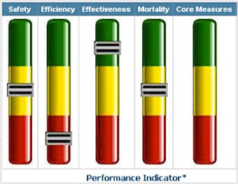
All that can be conveyed with these gauges is a vague notion of how well the center is doing on several measures. But they show nothing of comparison data or targets; you don’t know exactly how you are doing and how far away your goals are. Do you need to improve 5%, 10%, more? You have no idea. (And a viewer with red-green color blindness couldn’t understand much of anything at all!) These gauges look pretty, but convey no more than a hazy suggestion of data.
And seriously: gauges are such a literal interpretation of the presentation of a “dashboard.” We can and must do better than this, people!
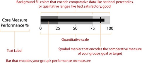
The following is a diagram of the parts of a Bullet Graph. I have modified Steve’s original labels (which referred to revenue sources) to show how you can use this visualization to display a medical center’s performance on Core Measures (for one example).
Got it? Now let’s drop the same information in one of the gauges into a Bullet Chart.
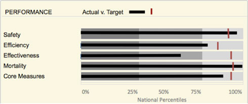
As you can see, information displayed in a Bullet Chart is much more informative and useful than that presented by the gauges shown above. Using a Bullet Graph, we can display national percentiles in the underlying quantitative scale, and place the medical center’s actual performance (represented by the center bar) against that backdrop. The center’s performance target (the red vertical bar) is also easy to compare, in this format, to both the background and the real-time performance indicator (the horizontal black bar).
When Steve developed the Bullet Graph in 2005, he was simply implementing his steely-eyed commitment to and passion for finding new, more effective alternatives for the display of data: layouts, icons, colors, proportions, and concepts that provided maximum information in minimum space and time. Being this efficient, focused, and dynamic in data presentation achieves the over-arching and most crucial goal: compelling the viewer to act.
As Bullet Charts have become more widely used by the very best designers, they have evolved and are often used in really interesting and creative ways. And I love that, too, because (will it surprise you to hear?) the display of data truly is a current event-always changing and developing.


1 Comment
3 (Really Good) Reasons Not to Use Gauges | Katherine S. Rowell & Associates · August 2, 2013 at 11:53 am
[…] terrific tools that you can use instead of a gauge, such as a bullet graph (read about them in my April 2012 newsletter) and sparklines (check them out in my January 2013 blog posting) — both convey far more data […]