Recently my colleague and HealthDataViz Senior Consultant Janet Steeger sent me the graph below and an associated article, with the subject line “Blog Posting?”.
Incredulousness was quickly followed by inspiration. How, we wondered, could super-smart people use such dumb graphs to display their data? In response, Janet came up with a great re- design (see below).
In a nutshell, the article is about the Value-Based Health Care Delivery (VBHCD) initiative at Harvard Business School, which engages with leading healthcare provider organizations to measure and manage patient-level costs over complete cycles of care for a variety of medical conditions.
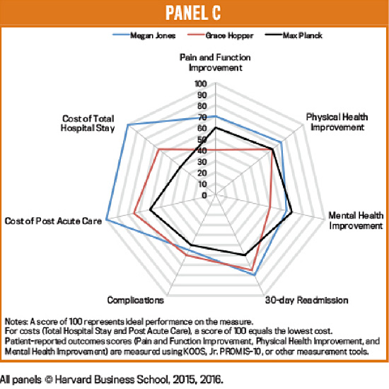
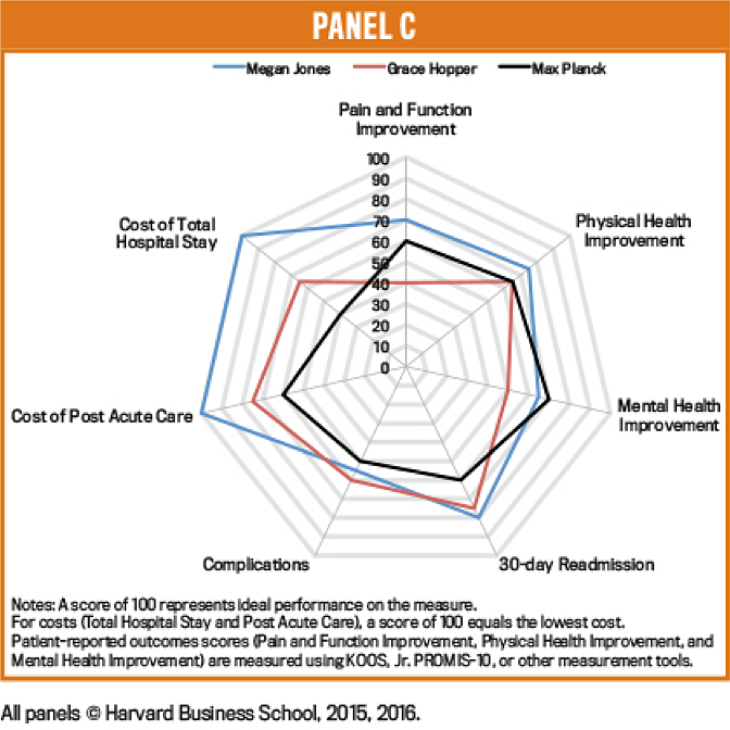
The Radar Chart displayed above (sometimes referred to as a Spider Chart, Web Chart, Polar Chart, or as Star Plots) is supposed to help us understand and compare three different provider results on cost, complications, and patient outcomes that are part of a study conducted by VBHCD.
Why this chart doesn’t work
A radar chart allows the viewer to compare multiple quantitative variables; some would also argue that it is most useful for viewing data outliers and displaying performance. Here, however, are a few of the reasons why this chart simply doesn’t work:
The values being displayed are different, and have therefore been rendered on the same scale so that they can be displayed together on this chart. The notes at the bottom of the chart indicate that a score of 100 equals the lowest cost, which to my perception is completely counter-intuitive, annoying and confusing.
Not only is it hard to visually compare the lengths of the different spokes shown; it is also hard to hold the scale in our memories and accurately judge the radial distances.
The lines connecting the data may occlude (obstruct) one another as the values grow closer, or if they are identical. It’s inevitable that when multiple series are plotted, some values will eventually be on top of and therefore blocking each other.
The area of the shapes presented increases as a square of the values rather than linearly. This may cause us to misinterpret the data displayed, because a small difference in the values results in a significant change in the area, so the difference is visually exaggerated.
Now we get to the part about the inspiration that followed our astonishment over anyone’s using such a misleading display format. Let’s agree to leave these radar charts that look very much like Charlotte’s web to our friends the spiders, and consider a better way to display this data (with thanks again to Janet for her re- design).
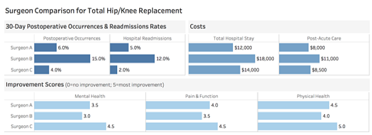
By using bar charts arranged one right below the other, and displaying the actual data (versus the converted form used to display the data in the radar chart), we can easily see and understand that:
Surgeon B has the highest cost for Total Hospital Stay and Post Acute Care, the highest Postoperative Occurrence Rate and Readmission Rate, and the lowest Patient Improvement Scores across the board. (Which brings to mind the iconic Ricky Ricardo’s line “Lucy, you got some ‘splainin’ to do.” But I digress.)
We can also quickly and easily see that although Surgeon C’s Total Hospital Stay Cost is the second highest at $14,000 (it is still $4,000 less then Surgeon B’s), his/her Postoperative Occurrence and Readmissions rates are by far the lowest at 4.0% and 2.0% respectively, and Patient Improvement Scores are the highest.
At first glance it would appear that the extra $4,000 for Total Hospital Care connected with Surgeon C was money well spent. We’d want to dig into the data a bit more to see if we couldn’t learn a thing or two to share with the other surgeons to help them achieve the same or similar results.
Here again, dear Subscriber, we are faced in the radar chart with a display that may look cool, but that simply doesn’t work. I think of what a wise little spider once told her dear friend Wilbur:
“Trust me, Wilbur. People are very gullible. They’ll believe anything they see in print.”
— E. B. White, Charlotte’s Web
Just because some very smart people decided to use a seemingly cool chart, we need not be so gullible as to believe it is the best way to display our data.


2 Comments
Roy Wilsker · April 30, 2018 at 10:15 am
In VBHC (value-based healthcare), one is continually struggling to balance multiple goals simultaneously – that’s why there are terms such as “Triple Aim”. So it’s important to try and see the multiple aims ranged against each other. The spider chart is much better for this than a bunch of bar charts.
Again, from the point of view of someone working in VBHC, lower costs (while maintaining a low complication rate) are a key goal. So it makes perfect sense to give the lowest cost the highest rating. I agree that a better title for that data point, say, “cost effectiveness”, would have been helpful (though perhaps more ambiguous).
The chart in question shows just what it should – one doctor comes out decidedly better than the rest of the people being measured in one category while being comparable to the other people in the other categories. That’s immediately apparent to someone who works in this area. That’s much harder to comprehend from multiple bar charts.
So, I’d have several takeaways:
* Descriptive labels matter
* Charts meant for people who work in a specific area may not be immediately clear to people who don’t know that area. Know your audience.
* The issue shouldn’t be whether a chart type is good or bad, but rather under what context one type of chart works better than another.
My feeling is that spider charts are very useful when an overall result depends on multiple attributes that may need to be balanced against each other. (Not surprisingly, Gartner uses spider charts to help companies analyze overall capabilities that depend on other capabilities.)
Kathy Rowell · April 30, 2018 at 4:19 pm
Thanks very much for taking time to not only read my posting but to send along your comments — I greatly appreciate it!
I won’t rehash the points in my newsletter as I believe they articulate my objections to the use of this type of graph to display this data — rather I will share a VERY interesting thing that happened to me just this morning that has never happened before. I was delivering a keynote address to a conference of a couple hundred health and healthcare professionals and I actually included this example in my talk. I showed the spider graph and pointed out the reasons why it doesn’t work very well and then I showed the redesigned graph and I said “let’s leave the spider web to Charlotte” when much to my sheer astonishment there was a roar of laughter followed by spontaneous applause. I kid you not, that has never happened in all the years I’ve been delivering talks — I was a tad flabbergasted, and we all had a bit of a chuckle at what must have been an astonished look on my face!
People are overwhelmed by data and information, and they need to see and compare results directly and easily — bar graphs fit the bill here because they are simple and allow for direct comparisons of the values. There is quite a bit written about spider or radar graphs that you may find of interest — here are a few posts from recognized experts in the field. Bottom line, for the work we do I still would forgo the spider/radar graphs.
http://www.perceptualedge.com/articles/dmreview/radar_graphs.pdf
http://www.thefunctionalart.com/2012/11/radar-graphs-avoid-them-999-of-time.html
I’m not familiar with the Gartner graphs that you are referring to so I cannot speak directly about them — I will say though that really great organizations (and really smart folks) may not always have the very best displays of data — it is a learned skill and one that is just now being taught in a formal way at colleges and universities, and even some elementary and high schools. That is a good thing because data visualization is not intuitive, rather it is a learned skill.
Thanks again for your thoughtful note.