Listen up folks… it is time for a red, yellow, green color intervention of the most serious kind. The use of red, yellow, green to indicate performance on your reports and dashboards has reached a crisis level and can no longer be ignored.
It is time for some serious professional help.
Here is your choice: go into color rehab treatment and clean up your act or, risk losing your stakeholders attention and – even more damaging – risk obscuring important information they require to make informed decisions.
And just to be clear – you are absolutely risking these things by overusing and incorrectly using red, yellow, green color coding in your reports and dashboards. (And besides, red, yellow, green is SO last season.)
I can read your thoughts – “but that is what people ask for – they want to emulate a stoplight – they LIKE red, yellow, green.” And I liked cheap beer until I tasted the good stuff.
Let’s consider how the use of these colors is hurting and your reports and what you can do to fix it.
1. Did you know that approximately 10% of all men and 1% of all women are colorblind? Yes, it is sad, but true. So, where most of us see this:
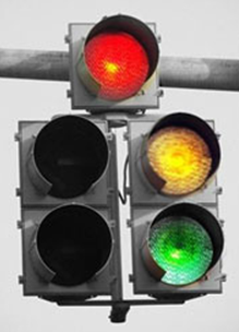
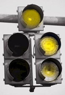
Our colorblind colleagues see this:
Which means, that when you publish a report that looks like this to the majority of us:
| Medical Center Results | 2010 | |||
| Q1 | Q2 | Q3 | Q4 | |
| Acute Myocardial Infarction (AMI) | ||||
| Aspirin at Arrival | 88% | 83% | 78% | 83% |
| Aspirin Prescribed at Discharge | 38% | 86% | 60% | 86% |
| ACEI or ARB for LVSD | 40% | 70% | 53% | 83% |
| Adult Smoking Cessation Advice/Counseling | 80% | 80% | 80% | 80% |
| Beta-Blocker Prescribed at Discharge | 89% | 92% | 89% | 87% |
| Fibrinolytic Therapy Received Within 30 Minutes of Hosp Arrival | 98% | 98% | 98% | 97% |
| Primary PCI Received Within 90 Minutes of Hospital Arrival | 86% | 86% | 86% | 65% |
There are about 10% of the men and 1% of women who will only see this:
| Medical Center Results | 2010 | |||
| Q1 | Q2 | Q3 | Q4 | |
| Acute Myocardial Infarction (AMI) | ||||
| Aspirin at Arrival | 88% | 83% | 78% | 83% |
| Aspirin Prescribed at Discharge | 38% | 86% | 60% | 86% |
| ACEI or ARB for LVSD | 40% | 70% | 53% | 83% |
| Adult Smoking Cessation Advice/Counseling | 80% | 80% | 80% | 80% |
| Beta-Blocker Prescribed at Discharge | 89% | 92% | 89% | 87% |
| Fibrinolytic Therapy Received Within 30 Minutes of Hosp Arrival | 98% | 98% | 98% | 97% |
| Primary PCI Received Within 90 Minutes of Hospital Arrival | 86% | 86% | 86% | 65% |
2. Additionally, without a column that indicates what the red, yellow and green thresholds mean (goal or benchmarking data) the viewer has no way of knowing when a measure rate changes. What is the rate that will change the color in this report to green? Or yellow? Or (oh horrors!) red?
And since when is red a “bad” color? It simply means stop on a traffic light – a very good thing for managing traffic. Red can symbolize fire, passion, heat and in many countries it is actually a symbol of good luck… but I digress.
Using all the red, yellow and green also breaks the big data display design rule – which is:
Increase the DATA INK and decrease the Non-Data INK
The data, data, data is what it is all about – not colors, gridlines and fanciful decoration.
So what can you to do without your stoplight colors in order to draw viewer’s attention to important data? Plenty…
You can eliminate all of the non-data ink and add data-ink to the areas of importance by:
- Italicizing and bolding
- Using soft hues of color to highlight data
- Applying simple enclosures to denote the data as belonging to a group that needs attention paid.
You can do all of these things as I have below or just one or two depending on how much data you have in your table.
| Medical Center Results | 2010 | ||||
| Acute Myocardial Infarction (AMI) | Q1 | Q2 | Q3 | Q4 | Target |
| Aspirin at Arrival | 88% | 83% | 78% | 83% | 80% |
| Aspirin Prescribed at Discharge | 38% | 86% | 60% | 86% | 80% |
| ACEI or ARB for LVSD | 40% | 70% | 53% | 83% | 80% |
| Adult Smoking Cessation Advice/Counseling | 80% | 80% | 80% | 80% | 80% |
| Beta-Blocker Prescribed at Discharge | 89% | 92% | 89% | 87% | 85% |
| Fibrinolytic Therapy Received Within 30 Minutes of Hosp Arrival | 98% | 98% | 98% | 97% | 95% |
| Primary PCI Received Within 90 Minutes of Hospital Arrival | 86% | 86% | 86% | 65% | 85% |
This method of displaying the data is much easier on the eyes and brain – it is far less jarring and allows the viewer to focus on the information that is important.
You could also simply sort and categorize the data to show where improvement is required versus where things are going well. Consider the following example report for Q3 results:
| Medical Center Results | 2010 | |||
| Acute Myocardial Infarction (AMI) | Q1 | Q2 | Q3 | Target |
| Measures Requiring Improvement: | ||||
| Aspirin at Arrival | 88% | 83% | 78% | 80% |
| Aspirin Prescribed at Discharge | 38% | 86% | 60% | 80% |
| ACEI or ARB for LVSD | 40% | 70% | 53% | 80% |
| Measures that Meet or Exceed Target: | ||||
| Adult Smoking Cessation Advice/Counseling | 80% | 80% | 80% | 80% |
| Beta-Blocker Prescribed at Discharge | 89% | 92% | 89% | 85% |
| Fibrinolytic Therapy Received Within 30 Minutes of Hosp Arrival | 98% | 98% | 98% | 95% |
| Primary PCI Received Within 90 Minutes of Hospital Arrival | 86% | 86% | 86% | 85% |
By arranging the report in this way I have eliminated the viewers need to hunt and peck and synthesize the measures that require improvement. They are at the top of the report and clearly and simply displayed.
Now go back and take a look at red, yellow, green table – check your pulse and note if your jaw is clenched. Look at the newly designed data tables – I bet you feel calmer already.
And if you were wondering how colorblind people manage to drive it is because of the order of the lights. They know that red is first, then yellow and green. If the lights are arranged horizontally though, all bets may be off and you should proceed with caution… lots and lots of caution…


4 Comments
Chris · March 8, 2017 at 8:24 am
I respectfully disagree to a certain point. Overuse of these colors is definitely distracting. However, looking at red signifies danger or warning to me…it is not just a color on a stop light. These colors can be used as a quick visual when someone may not want to delve deep into the data at that particular time.
Kathy Rowell · March 8, 2017 at 1:00 pm
Thanks for reading the newsletter and taking time to send along your thoughts! I agree with you, there are times when using one color such as red to call out a metric that may need attention is appropriate and helpful. The problem we see all too often however is the use of red, yellow, green in combination, which is not only overwhelming to viewers but also unable to be seen by folks who are colorblind. Hope that helps to provide a bit of clarification.
BI Explorer · November 1, 2019 at 9:41 am
Yes, I totally agree with the author. When GUI was at it’s beginning, like in the late 90’s, traffic light colors became one of our reference for critical analysis of data. Now that the data visualization has become an integral part of our corporate life it’s high time we replace these colors. Since we still have the job to make both the baby boomers and the millennial crowd happy what are the alternate colors that can replace these Christmas colors. Please advise.
Kathy Rowell · November 1, 2019 at 1:17 pm
Thanks for your note — I would direct you to check out my latest post about icons and how to use them. I would also advise that if your data is being displayed in table, let a table be a table and eliminate all of the colors. If there is something folks need to see just code it in red or again, check out my post on icons.